Bare
Bare is a clean skincare and body care concept built around simple ingredients, stripped-back routines and honest skin. Natural textures, warm neutral tones and minimal packaging create a calm, premium and grounded identity that feels tactile, raw and real rather than clinical.
The Concept
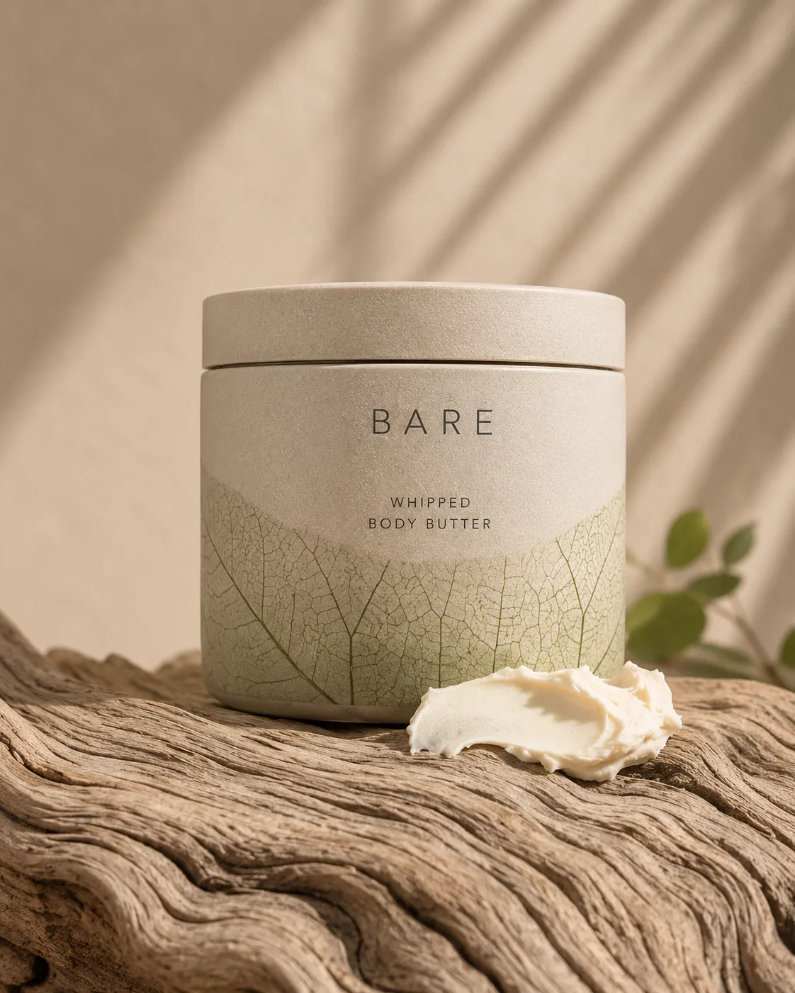
Bare is designed to feel tactile, raw and real - a soft balance between beauty, nature and simplicity. The direction leans on natural textures, warm neutral tones and minimal packaging, drawing from bare skin, natural stone, driftwood, cactus textures and leaf-vein patterns to feel premium and grounded rather than clinical.
Honest skin. Stripped back.
The Brief
Create a product system that feels minimal and refined, but still carries enough texture and detail to feel memorable. The logo is kept very simple and spacious, letting the packaging patterns and product photography carry most of the brand personality.
Texture Language
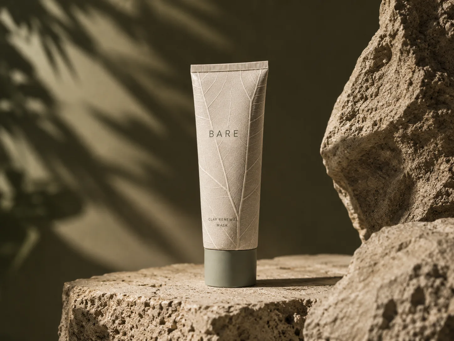
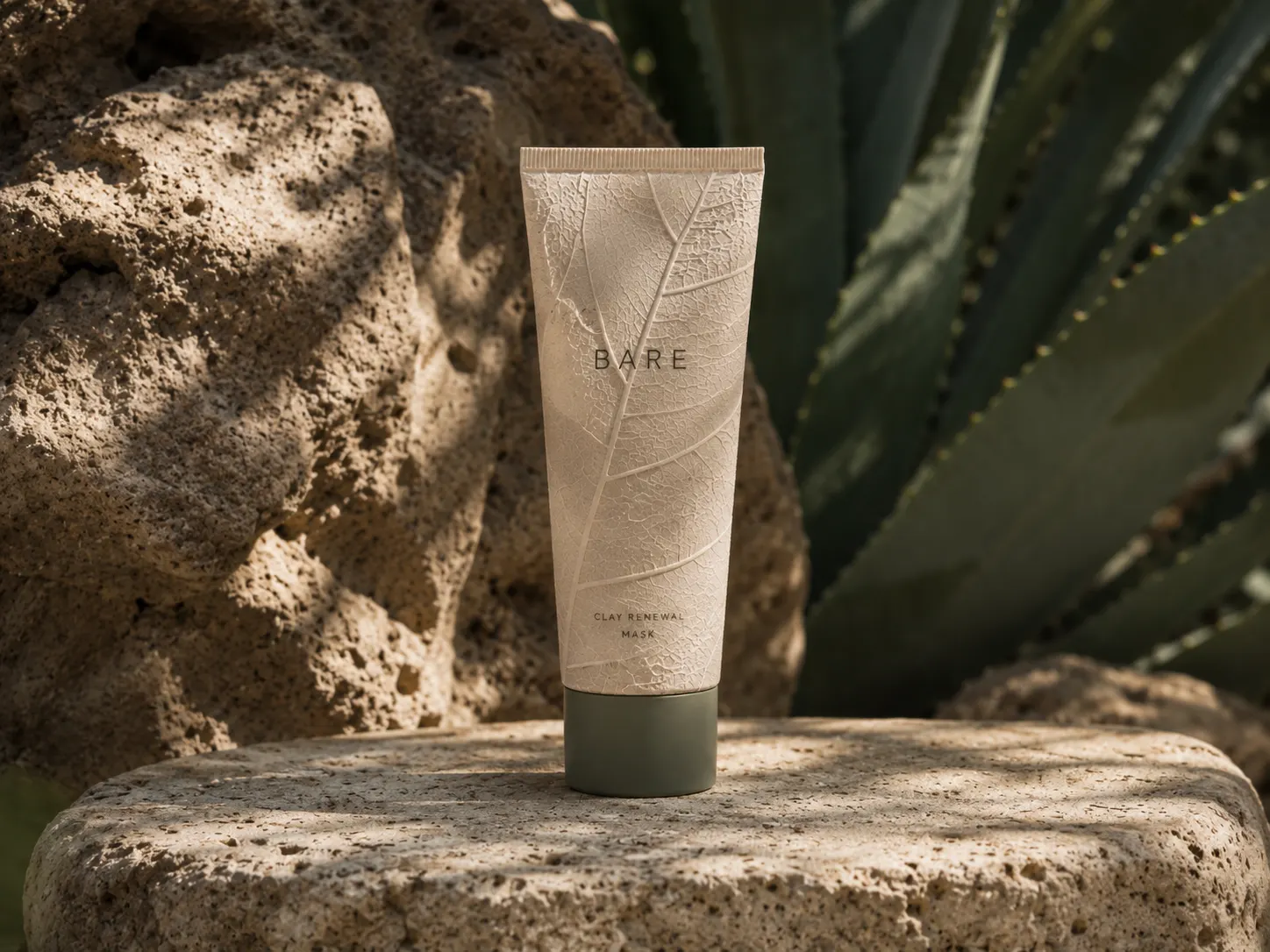
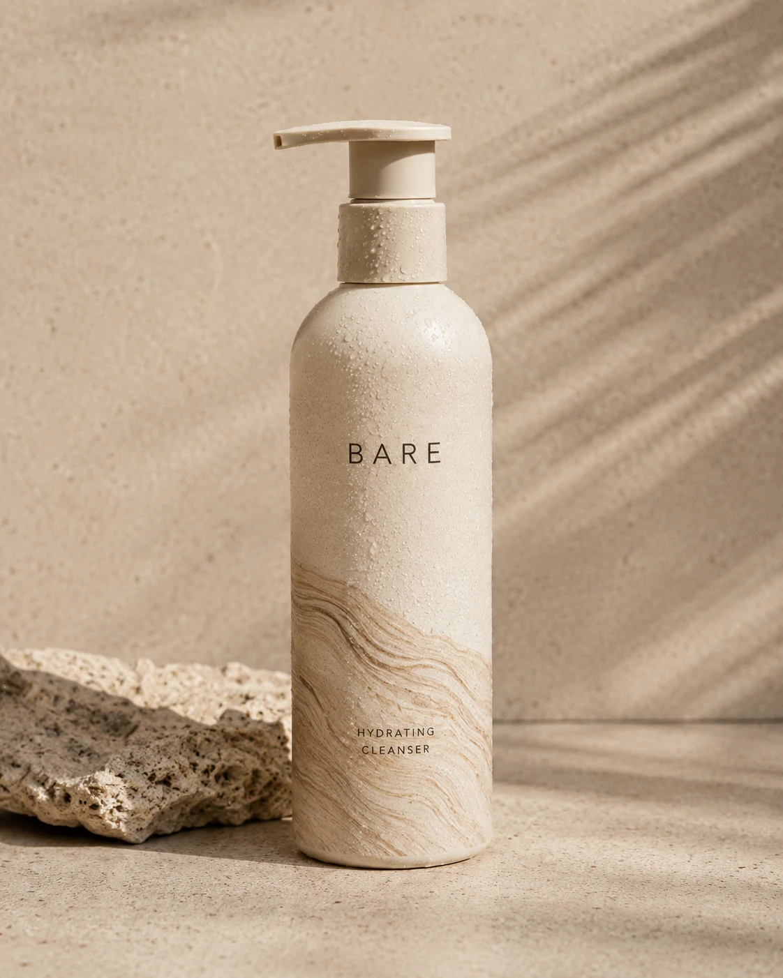
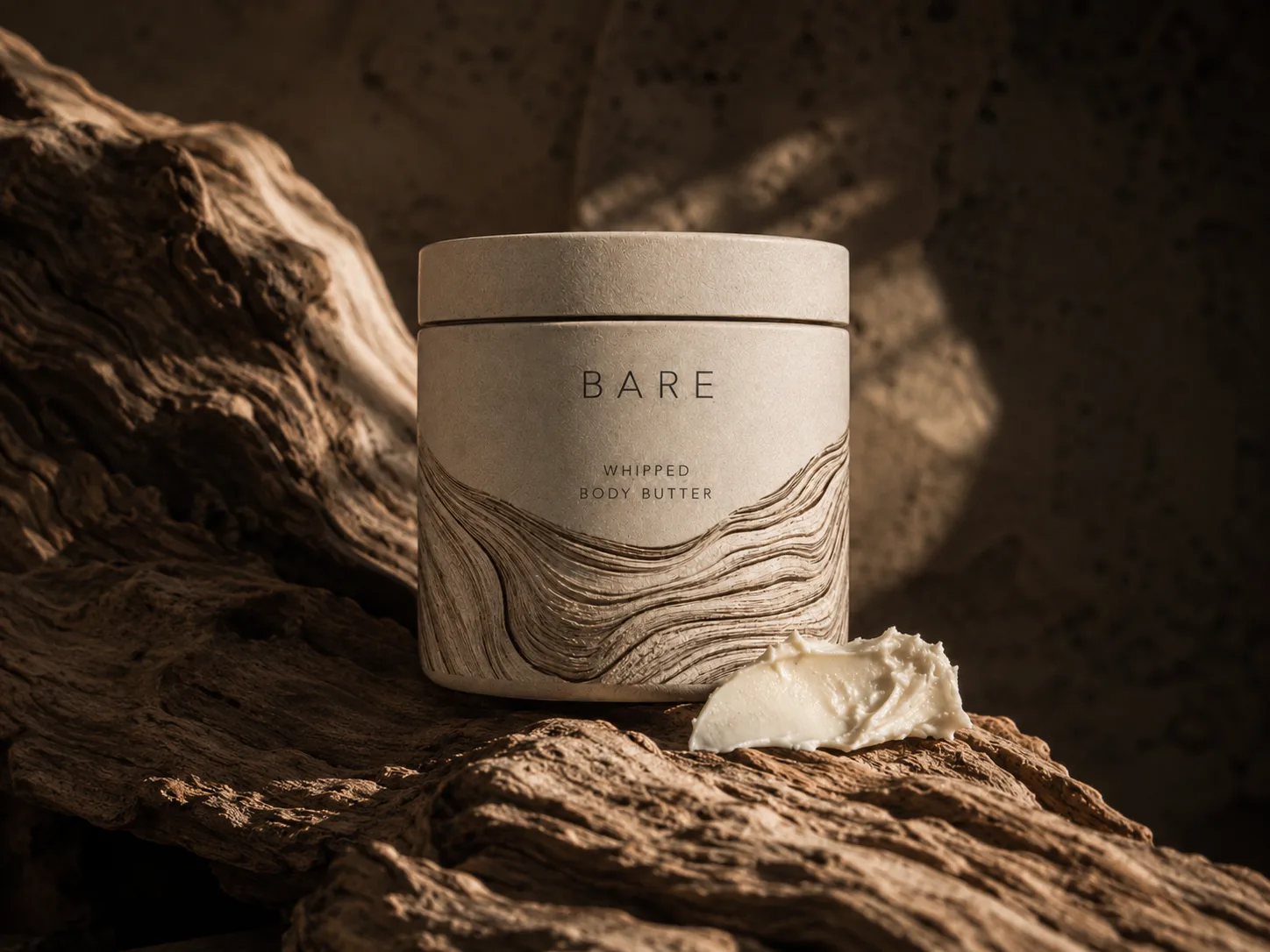
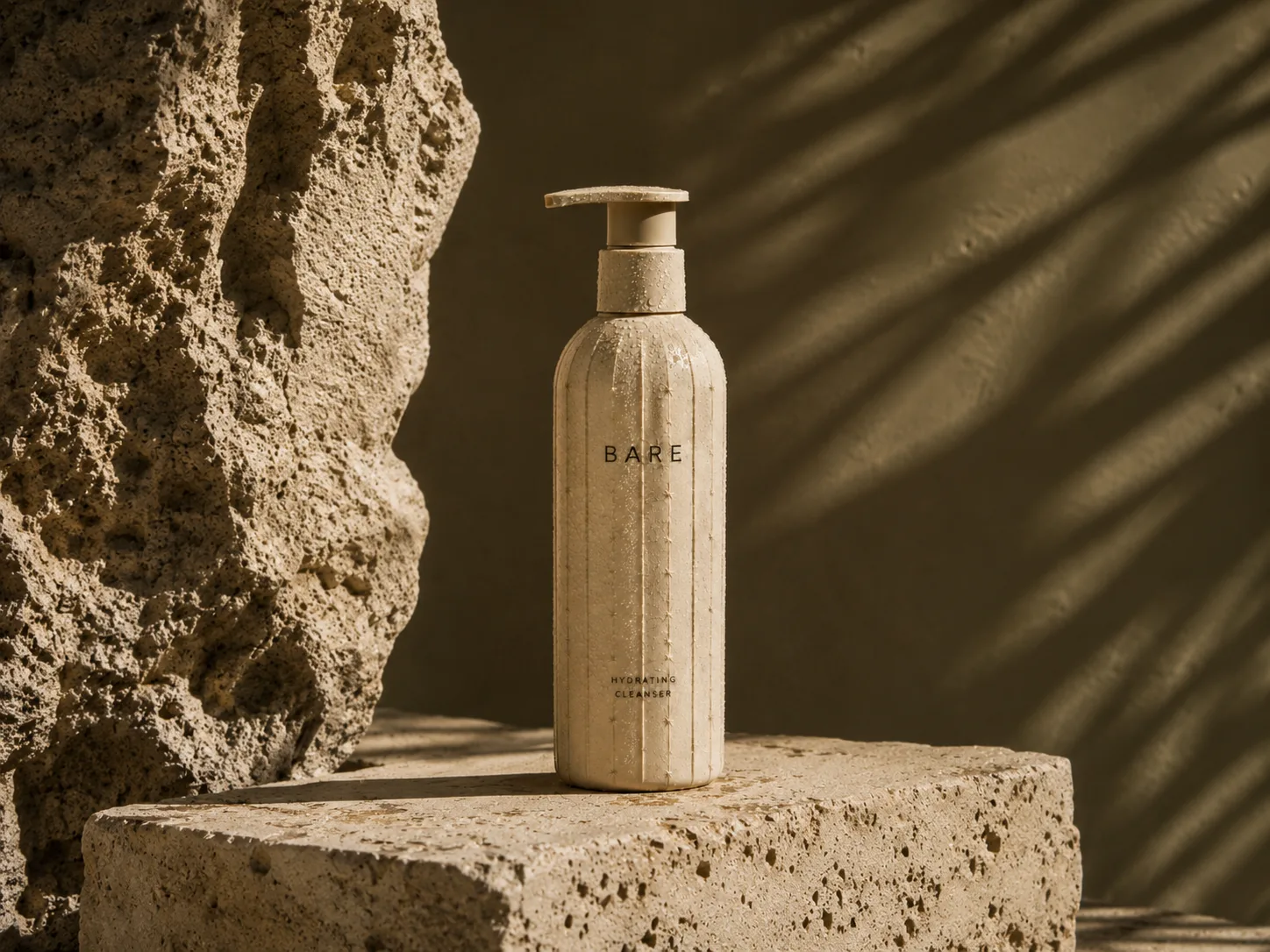
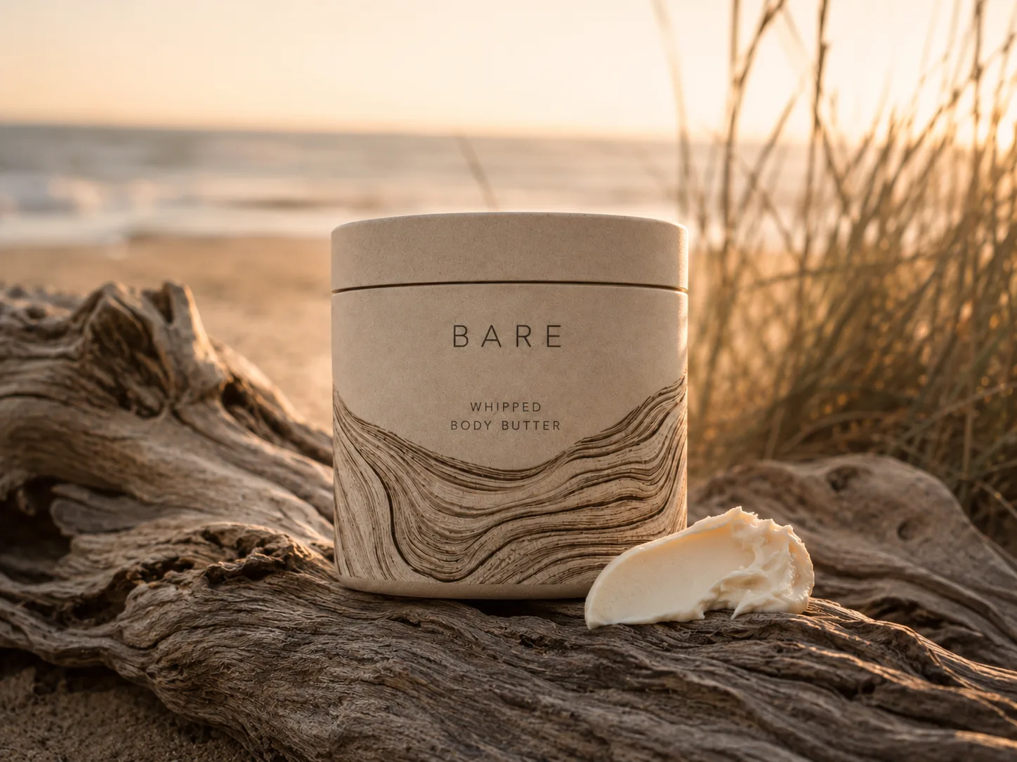
Each product is given its own pattern based on natural forms - a cactus-inspired ribbed surface for the cleanser, a bold leaf-vein pattern for the clay mask, and a flowing driftwood grain for the body butter - distinctive yet unmistakably part of one stripped-back range.
The Process
Stripped-back Concept
Define a calm, grounded identity built on simple typography, honest materials and warm neutral tones.
Studio Range
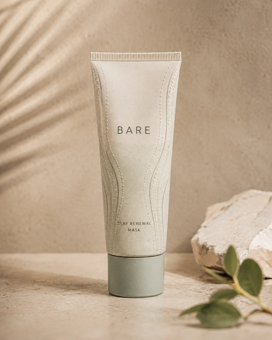
Shoot the core range - cleanser, clay mask, body butter and body oil - on stone and cream textures in soft beige light.
Texture Packaging
Give each product its own natural pattern language while keeping one consistent, minimal logo system.
Nature Campaign
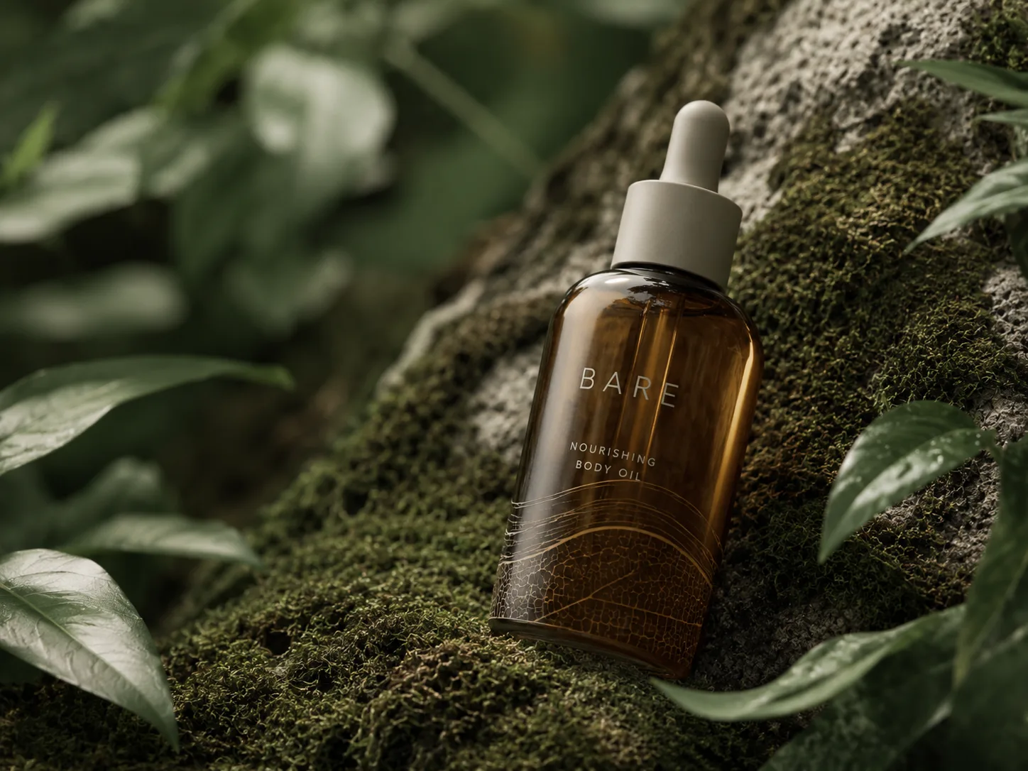
Move the products outside onto rock, driftwood, moss and sand with golden-hour and moody forest light.