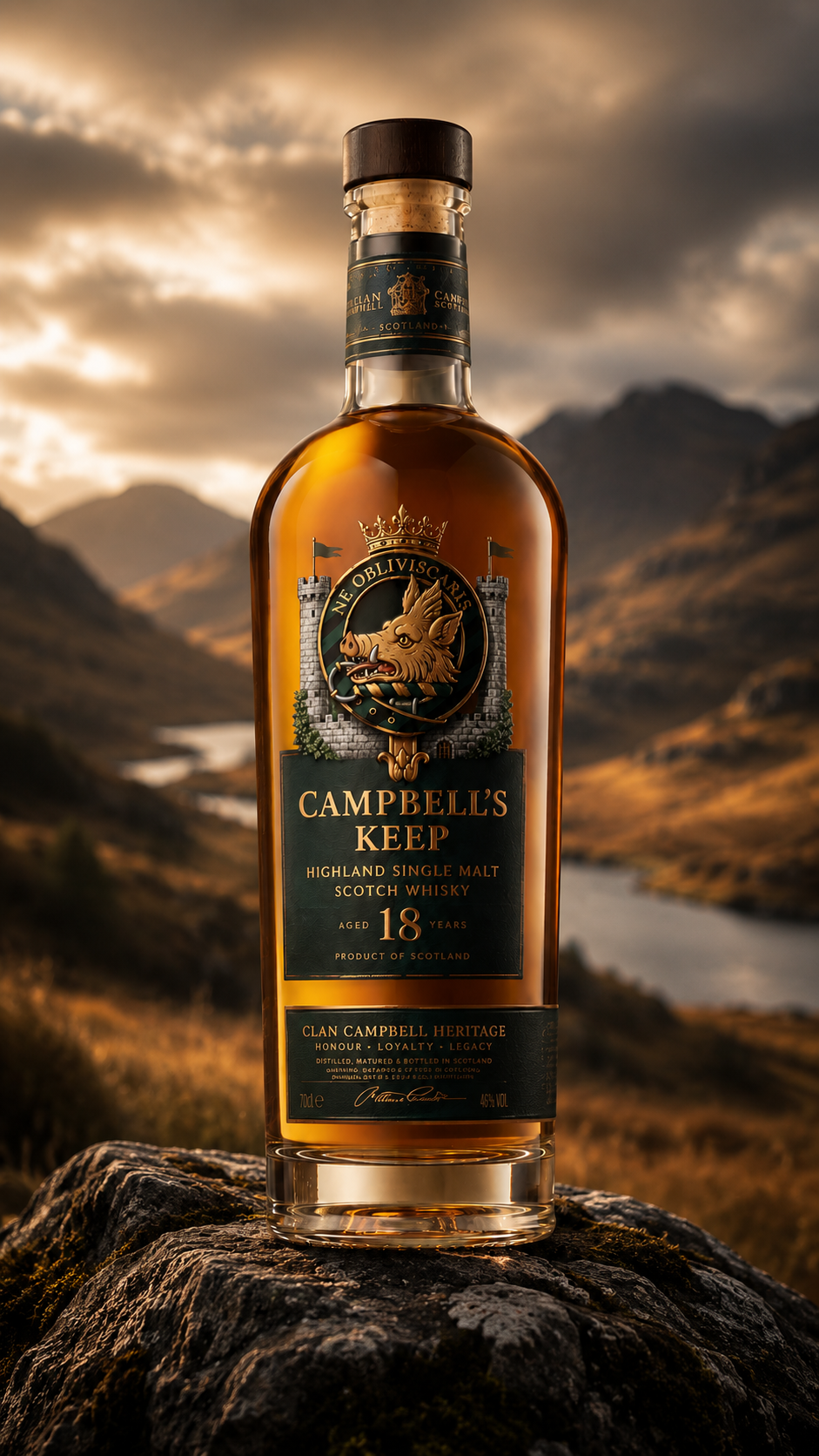
Scottish Highlands
Landscapes, lochs, mist, stone and natural atmosphere - the dramatic countryside that gives the whisky its sense of place and origin.
Brand Concept · Highland Single Malt · 2026
Highland Single Malt Scotch Whisky
Born of Scotland. Bound by Legacy.
01 — The Concept
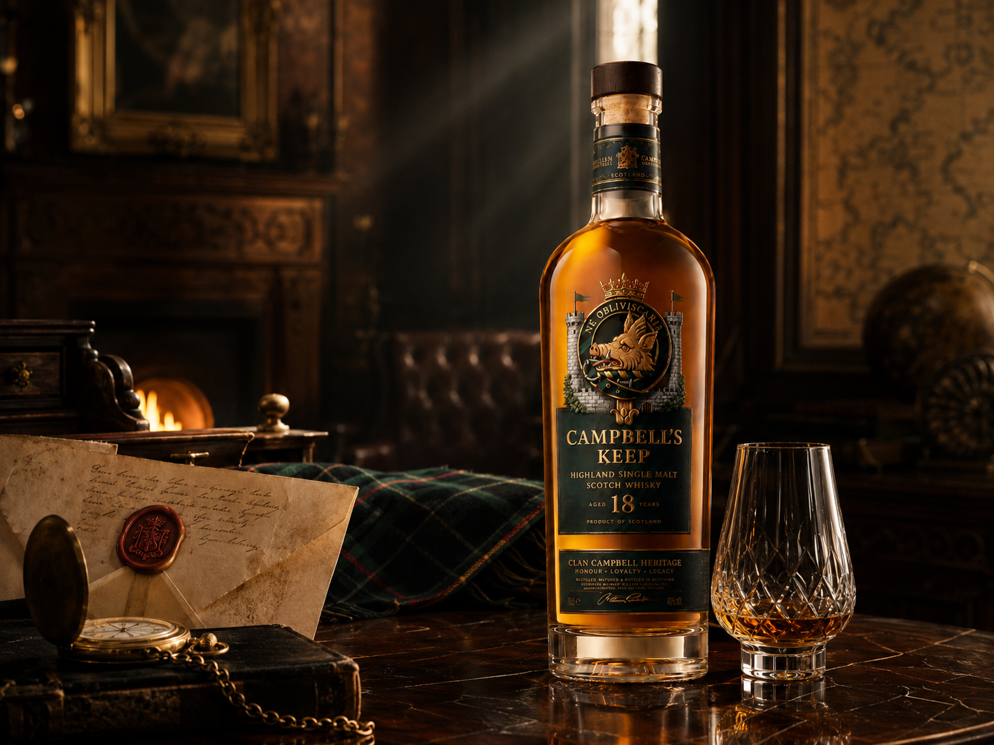
Campbell’s Keep is a premium whisky concept inspired by the heritage of Clan Campbell and the dramatic beauty of the Scottish Highlands. It began with a simple idea: create a whisky identity for a family that wanted to proudly honour its Scottish ancestry while still feeling like a modern premium spirits brand.
The project explored how historical symbolism, colour psychology, Scotch packaging conventions and cinematic product mockups could come together into a believable brand system. Rather than relying on minimal luxury alone, Campbell’s Keep is built around story, place and legacy.
02 — Research Direction
The research phase focused on three areas - Scottish visual heritage, Clan Campbell symbolism and premium whisky packaging - so the brand felt connected to a specific family, place and story rather than a generic luxury label.
Landscapes, lochs, mist, stone and natural atmosphere - the dramatic countryside that gives the whisky its sense of place and origin.
Tartan, the boar crest, crown, castle and heraldry of Clan Campbell - the symbolism that anchors the brand to a real family story.
Dark glass, gold foil, amber liquid, wooden barrels and moody lighting - the category cues that signal maturity and luxury.
03 — Colour System
Deep green, navy and black connect back to Campbell tartan, while antique gold and warm amber introduce the luxury spirits character. Small accents of tartan red and heather purple add depth without making the brand feel overly decorative.
04 — Building the Crest
The logo exploration began with the idea of incorporating the Clan Campbell emblem into a premium whisky mark. Early directions explored crest badges, circular seals, monograms and shields. The strongest came from combining the boar with a crown and castle structure - regal, protective and deeply connected to clan heritage.
The boar needed to feel powerful but never cartoonish. Its head was set to break slightly outside the circular ribbon for a stronger silhouette, and a crown was added above to reinforce authority and prestige. The final crest unites boar, ribbon, crown and castle towers into one cohesive mark.
05 — Typography System
A refined classical serif direction matches the whisky category and the heraldic crest - generous spacing, uppercase styling and antique gold colouring create age, confidence and luxury without tipping into the medieval.
Campbell's Keep
Highland Single Malt
Aged eighteen years in oak, born of the Highlands and bound to the legacy of Clan Campbell.
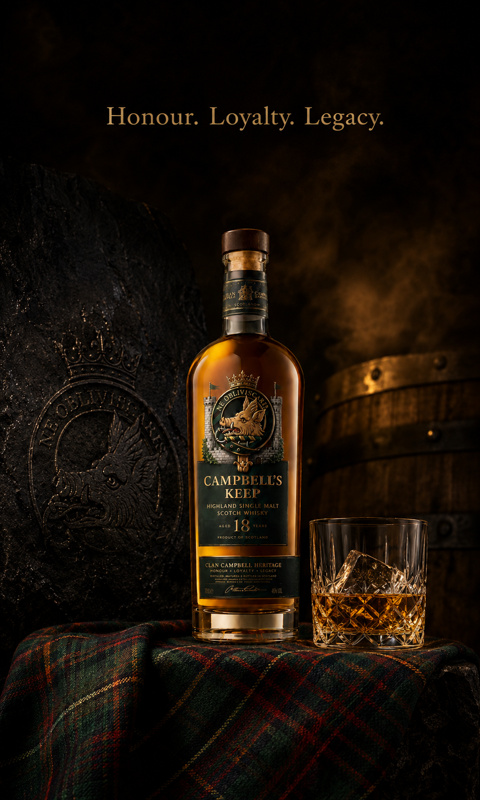
Honour, loyalty and legacy - carried forward in every bottle.
06 — Bottle Form & Label
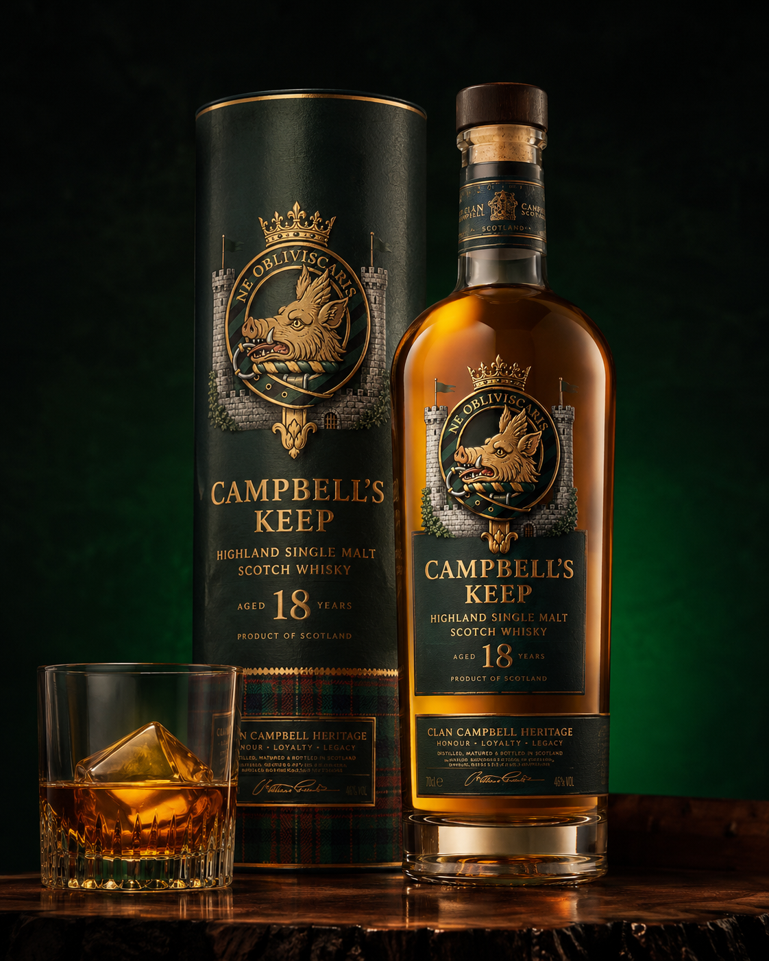
A tall round bottle with soft shoulders was chosen because it reads as tradition, maturity and refinement - a familiar premium Scotch silhouette that lets the crest and label remain the hero.
The final bottle uses warm amber liquid, a dark green label, antique gold typography, a wooden stopper and the detailed crest at the top of the label. The 18-year age statement adds prestige, while the lower panel introduces the brand values: honour, loyalty and legacy.
07 — Premium Packaging
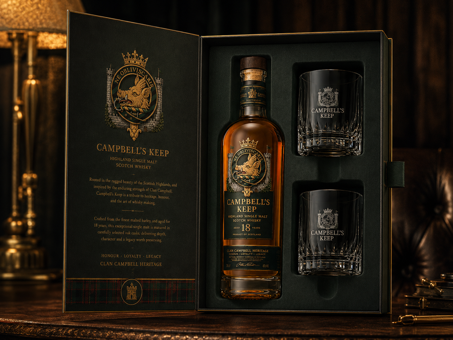
The packaging extends the brand beyond the bottle. A matching cylindrical tube carries the same green, gold and tartan language, while a luxury gift box holds the bottle and two branded glasses in a vertical open presentation - fitted inserts, gold edging and a heritage story panel inside the lid for a ceremonial unboxing.
08 — Campaign World
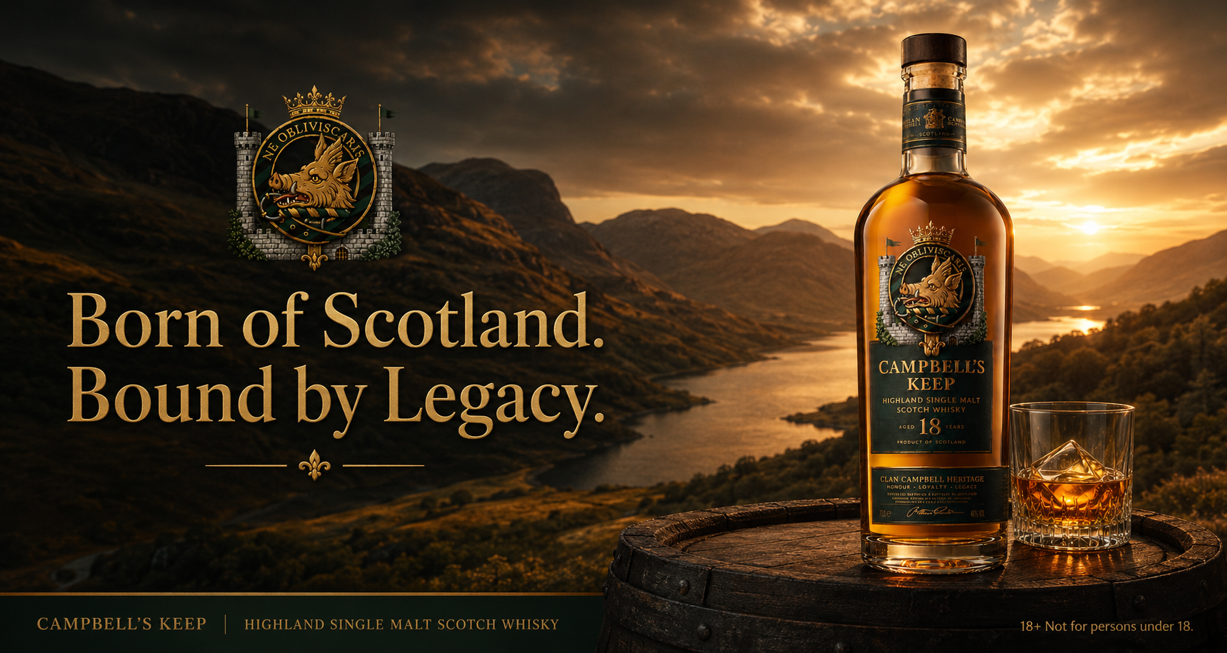
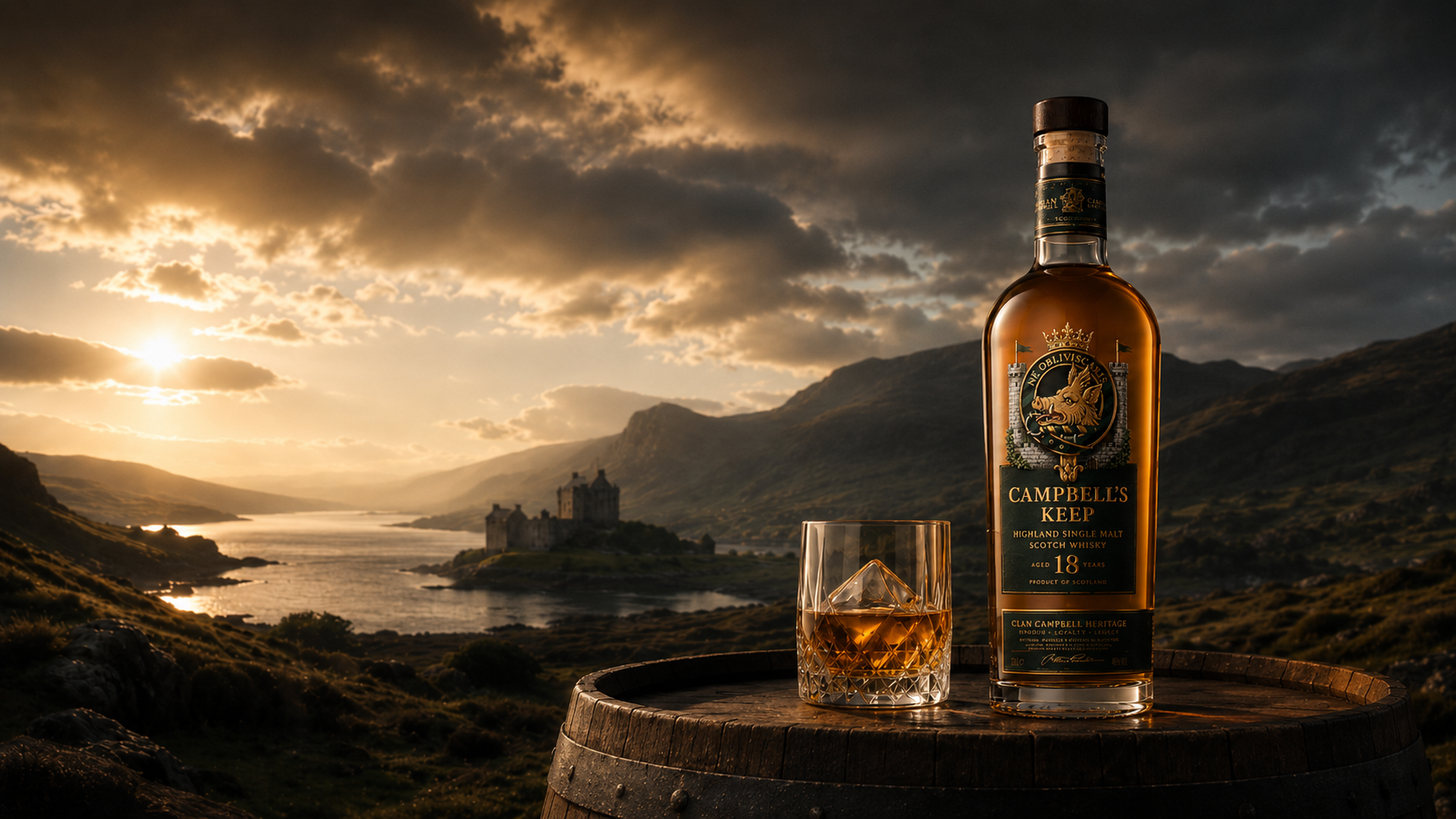
The campaign is built around the emotional idea of legacy. The bottle is always the hero, placed within a larger Scottish world of Highlands, castles, barrels and tartan - the environment supporting the story rather than distracting from it.
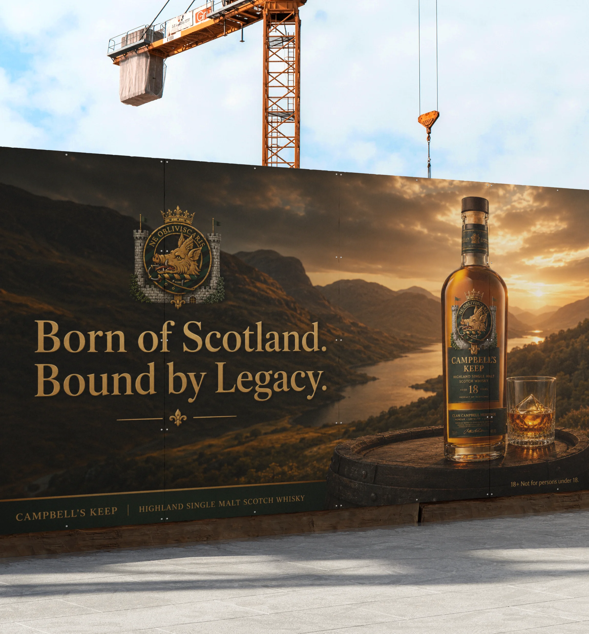
09 — Highway Billboard
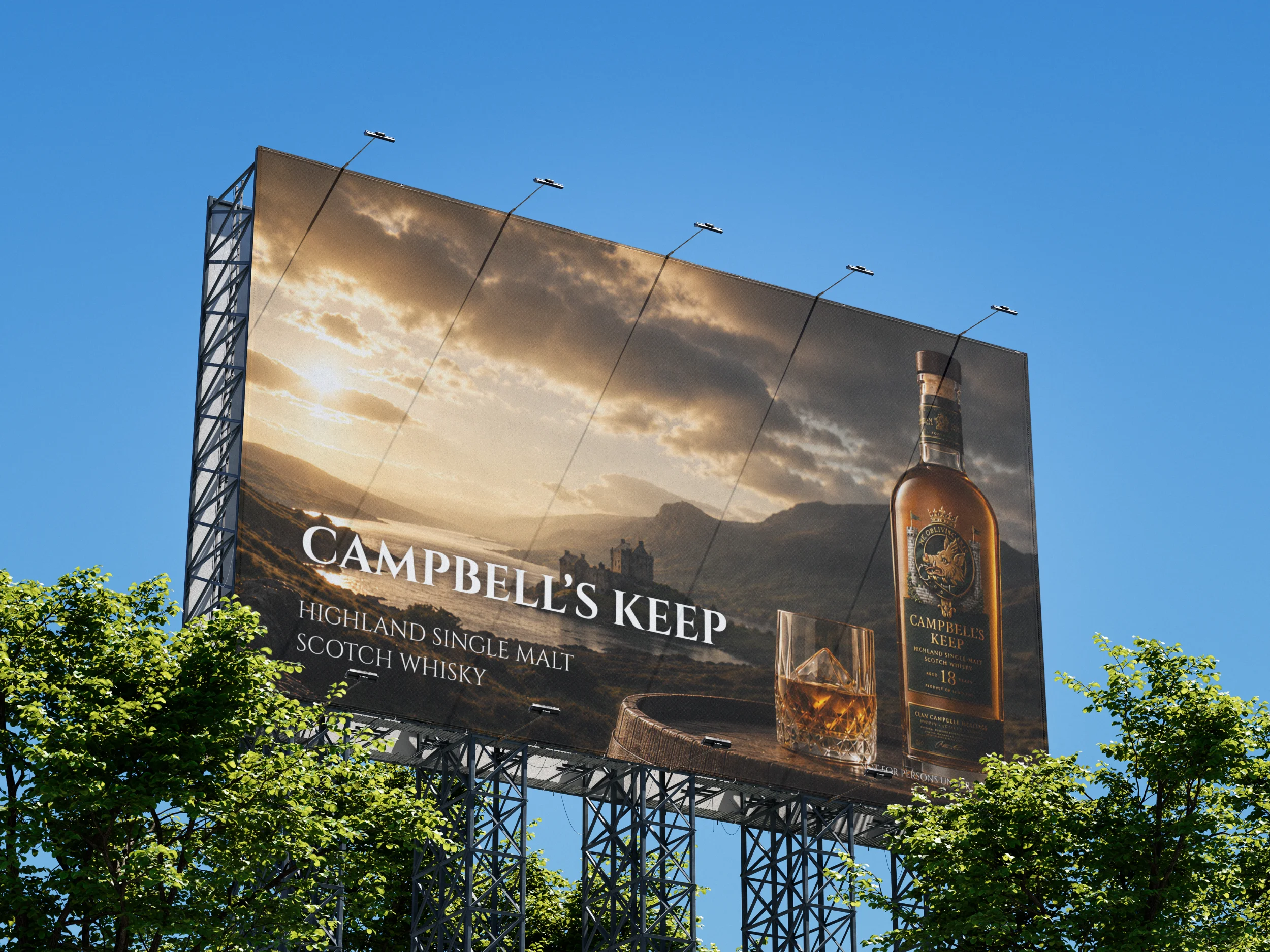
Designed for a very wide outdoor format where the message must be immediate. Landscape and story sit on the left, product on the right, with the headline in antique gold against the dark Highland scene - and a footer banner for brand, category and age restriction.
10 — Brand Values
A whisky concept shaped by clan heritage, Highland craft and the weight of family history.
11 — Final Outcome
The final system moves from research and emblem exploration into a fully realised bottle, packaging, gift box and campaign world. A detailed heraldic crest, traditional Scotch form, dark green and gold palette, tartan accents, premium glassware and Highland advertising all work together to make Campbell’s Keep feel rooted, authentic and collectible - not just a mockup, but a complete visual world built around honour, loyalty and legacy.