Raw Texture
Kraft paper, torn edges, grain, crumbs and tactile surfaces - the honest, handmade feel at the core of the packaging.
Brand Concept · Protein Snack Range · 2026
Protein Snack Range
Real Food. Real Fuel.
01 — The Concept
GRIT is a fictional protein snack range created around raw, no-fuss snacking. The idea was simple: build a snack brand that feels bold, natural and satisfying without becoming too polished or overly “health brand” in its visual language.
The project explored how one identity could stretch across many formats - protein chips, fruit chips, snack bars, cookies, crunch bites and granola slabs - so each item feels unique while still belonging to the same larger family.
02 — Research Direction
The research focused on three areas - bold snack branding, raw ingredient styling and flexible packaging systems - to build a range that felt tactile, flavourful and commercially believable rather than a generic protein brand.
Kraft paper, torn edges, grain, crumbs and tactile surfaces - the honest, handmade feel at the core of the packaging.
Large typography, punchy colour, strong flavour names and shelf impact - confidence over clinical wellness styling.
Fruit, oats, nuts, spices, coconut and chocolate styled fresh - the flavour story told through real food, not graphics.
03 — Colour System
A core green and black system keeps the brand consistent, while cream and kraft tones give it a raw, tactile feel. Each flavour then introduces its own accent colour, so the range feels varied and full without becoming disconnected.
04 — Building the GRIT Mark
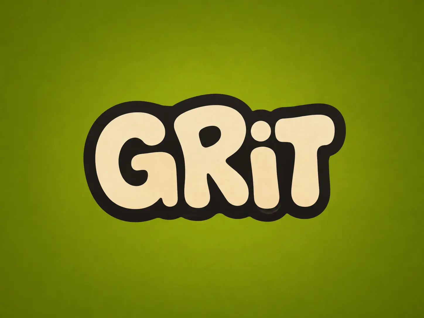
The logo needed to sit confidently across many packaging formats - chunky, simple and memorable, with enough personality for chips, bars, cookies and granola. The final mark uses rounded cream lettering with a thick black outline; the slightly irregular letter shapes feel handmade without being childish.
That heavy outline keeps the logo readable against busy patterns, ingredient photography and strong flavour colours. On every product it becomes the anchor - holding the range together even as format, palette and styling change.
05 — Typography System
Since the logo already carries a strong rounded personality, supporting type uses heavy uppercase styling to keep product names clear and direct - impact, clarity and shelf-readability over delicate or premium typography.
REAL FOOD. REAL FUEL.
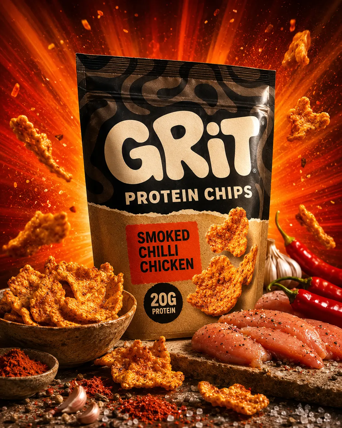
SMOKED CHILLI CHICKEN
One identity stretched across chips, bars, cookies and granola - each item unique, all unmistakably GRIT.
HIGH IN FIBRE · PLANT BASED · NO NASTIES
06 — Flexible Snack Packaging
The packaging system shows how GRIT exists as a full range rather than a single product. Each format fits its snack type while keeping the same core identity: bold logo, organic wave pattern, strong flavour block, rough texture and ingredient-led visuals.
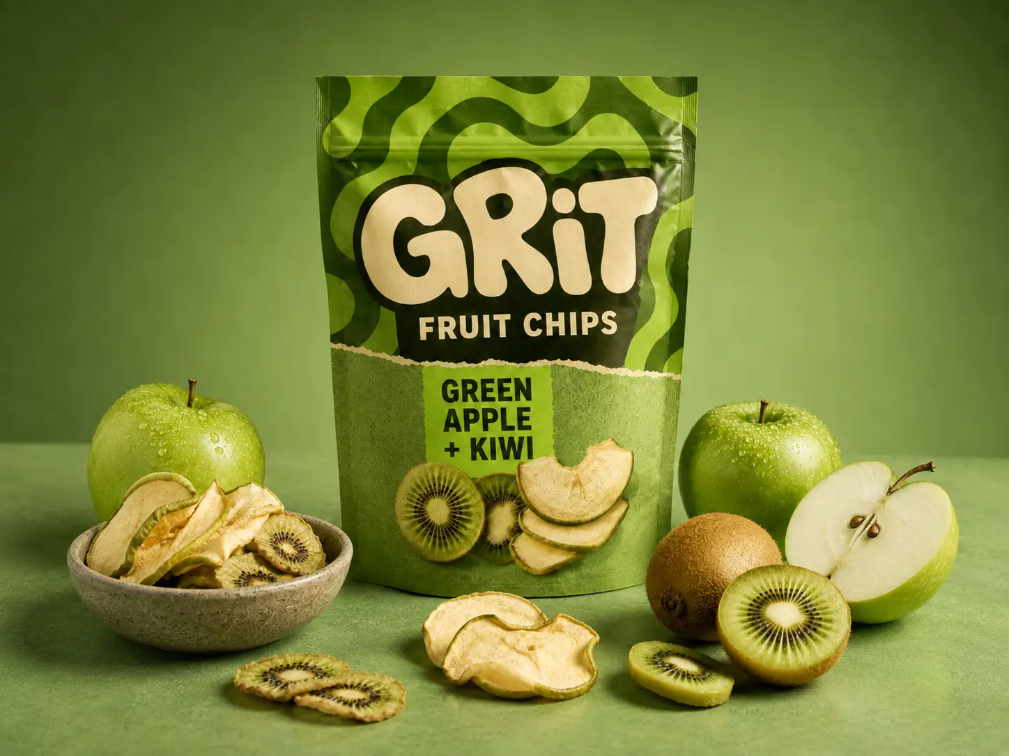
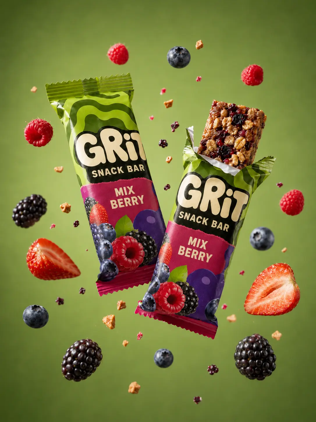
Chips use a large resealable pouch; fruit chips a cleaner green pouch; bars individual wrappers; cookies a box with matching sleeve; and granola a kraft sleeve around an exposed slab for a natural, handmade feel.
07 — Flavour Range Development
Each product was given a flavour direction styled clearly through colour, ingredients and packaging format. Savoury products lean into reds, browns and warm light; fruit-led products into greens, blues and cleaner studio backgrounds. The names stay direct and appetite-led.
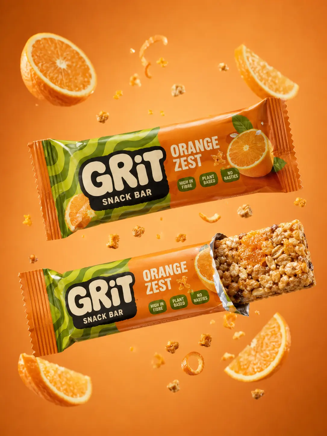
08 — Studio Product Photography
The photography makes the range feel like a real commercial campaign - packaging shown clearly while ingredients feel fresh, tactile and appetising. The savoury hero used an explosive radial setup; the fruit and bar shots moved into softer and freeze-motion studio directions.
09 — Campaign World
Rather than a gym-only protein brand, the campaign positions GRIT as everyday fuel with strong flavour and satisfying texture - studio lighting, ingredient motion, bold colour backgrounds and close, tactile product framing. The tone is bold, grounded and direct.
“Real Food. Real Fuel.”
10 — Logo-to-Product Promo
A short promo direction shows the brand moving from a static logo into a product-focused campaign video - bold but realistic, with slow-motion ingredients and a sharp final hero frame. No extra words, no packaging changes.
Open on the GRIT logo centred on a coloured background.
Push the camera toward the mark as the energy builds.
Let the logo dissolve into the packaging design and wave pattern.
Reveal the product in a studio setup as the hero.
Slow-motion ingredients and crumbs drift through the frame.
Settle on a clean, sharp product hero frame.
11 — Brand Values
A protein snack range shaped by real ingredients, strong flavour and chunky texture.
12 — Final Outcome
The final system moves from research and logo exploration into a fully realised range of product mockups, ingredient-led studio photography and campaign visuals. A chunky rounded wordmark, thick black outline, cream type, green base, flavour-led palettes, kraft textures and organic wave patterns make every product feel distinct while the brand stays consistent across pouches, wrappers, boxes and sleeves - a snack brand that feels energetic, tactile and commercially believable.