Moodies
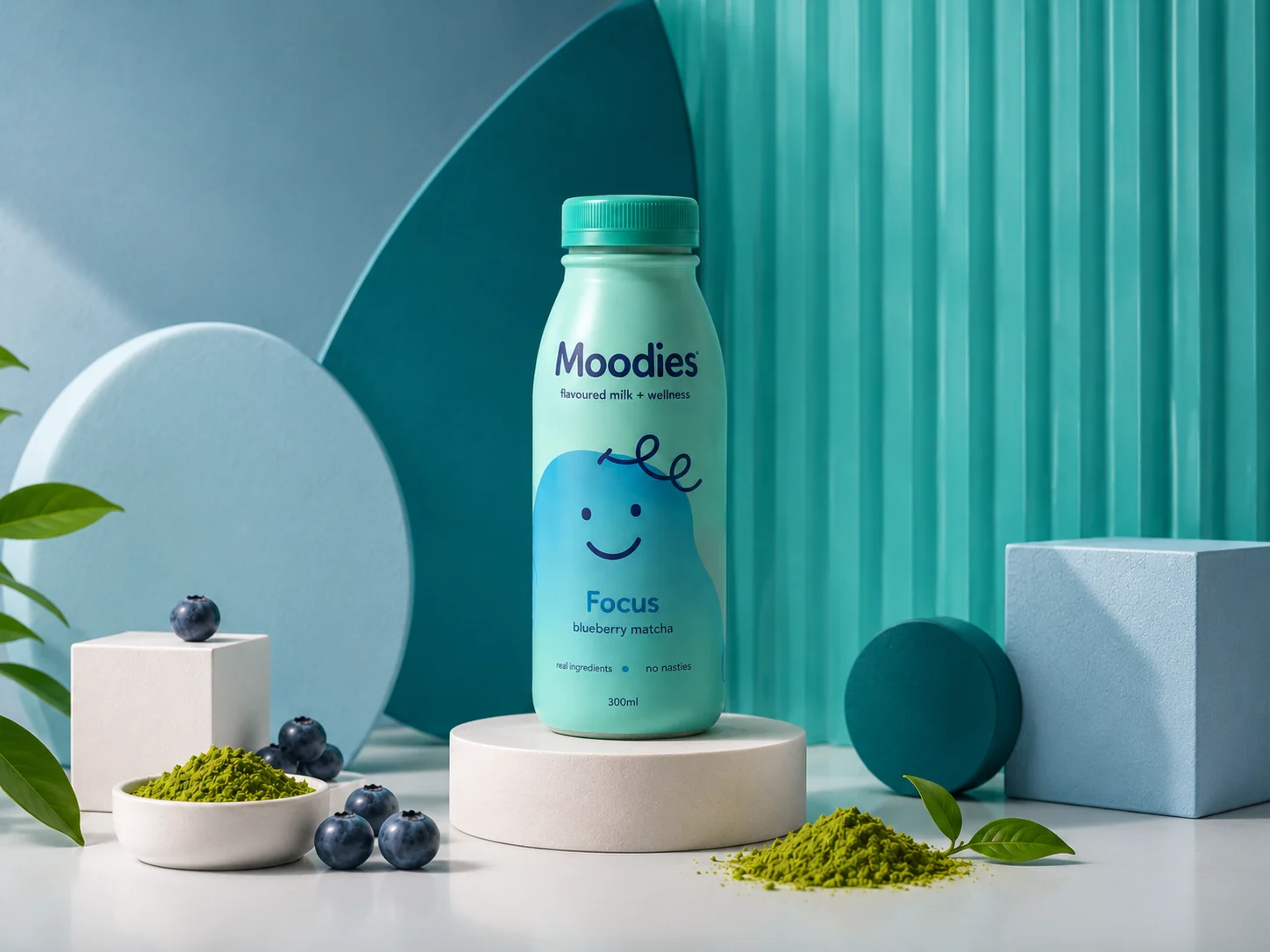
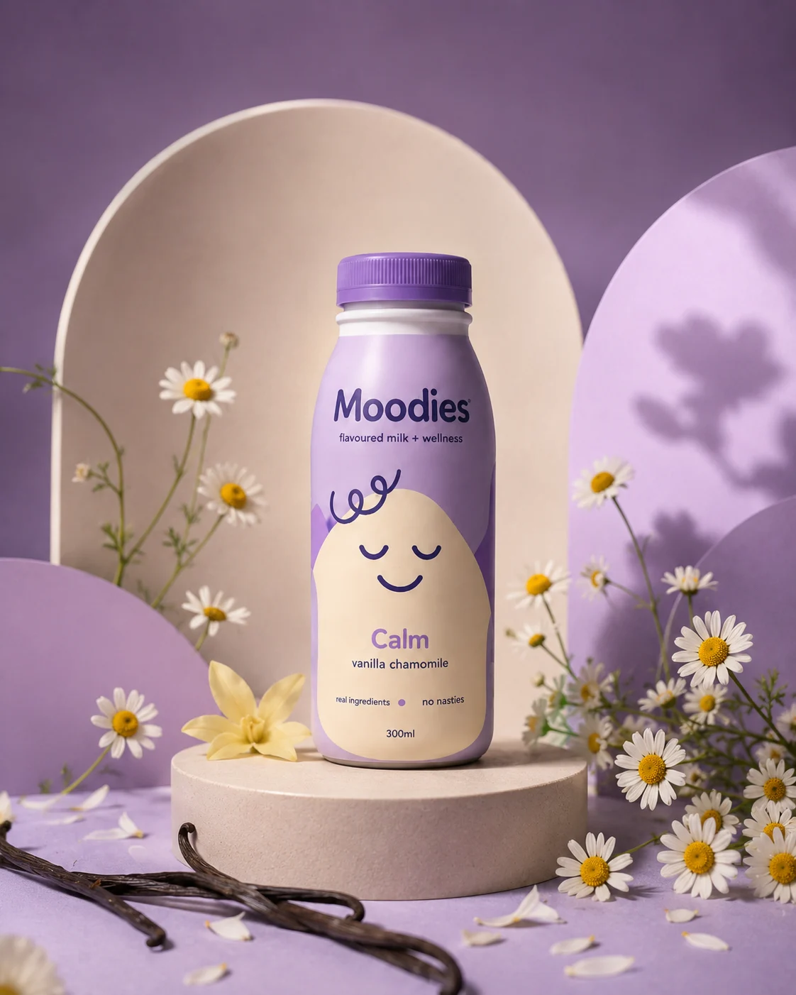
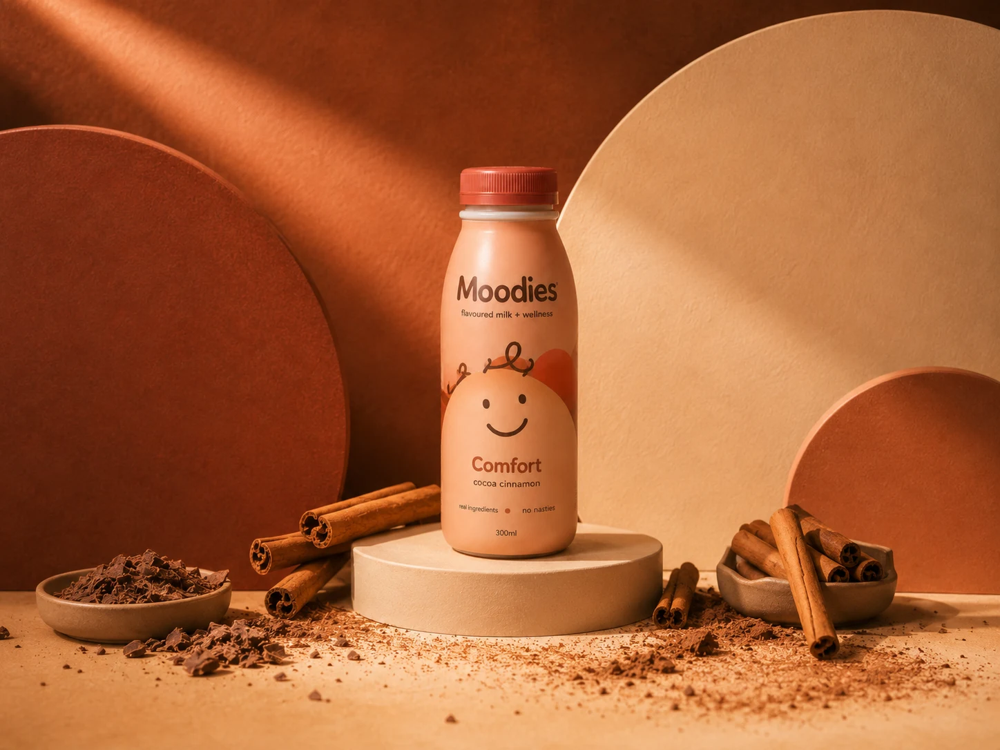
Moodies is a playful flavoured milk and wellness drink concept built on the idea that every flavour connects to a specific feeling. Friendly, expressive and colourful, it pairs soft rounded typography and minimal character illustrations with flavour-led palettes to give every bottle its own personality.
The Concept
Instead of naming drinks after their ingredients, Moodies pairs a mood with a flavour profile - creating a more emotional and memorable range. The direction is friendly, expressive and colourful: soft rounded typography, minimal character illustrations and flavour-led palettes give each bottle its own personality, while a shared core layout keeps the range consistent.
The Brief
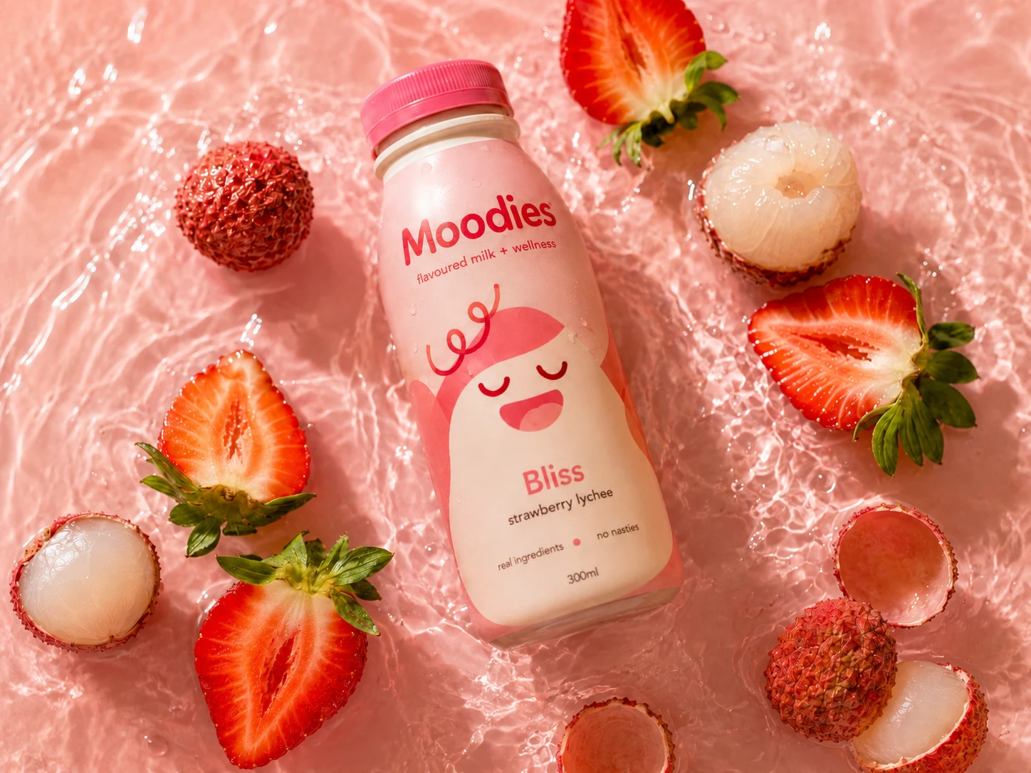
Build a product system that feels fun and youthful, yet polished enough to exist as a real retail beverage brand. Inspired by bold packaging, smiley-face graphics and playful character branding, each bottle reuses the same structure while colours, expressions and ingredient styling shift to reflect the mood and flavour.
Packaging & Logo
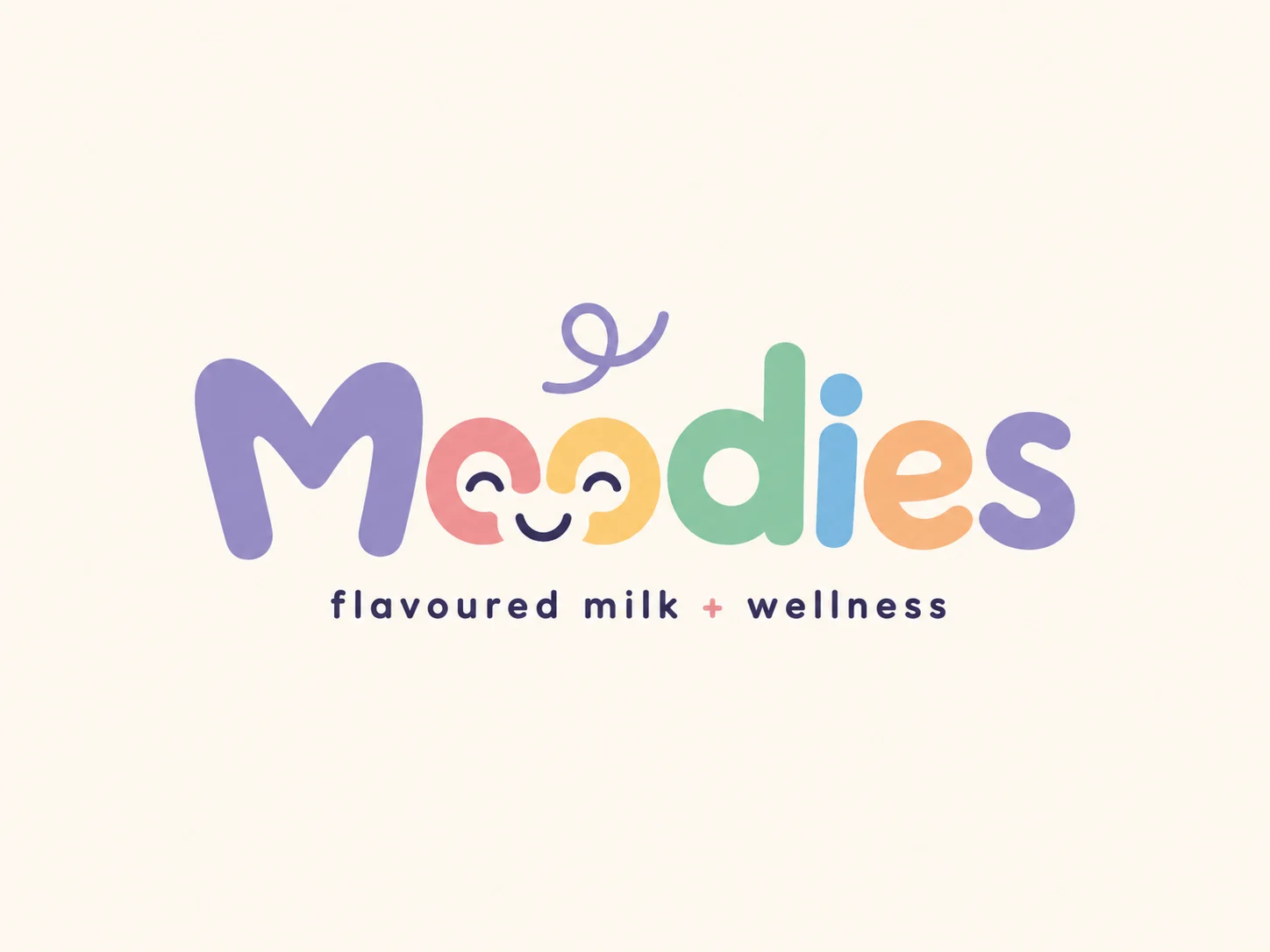
The packaging uses a simplified one-colour Moodies wordmark to stay clean and legible across every flavour colour, while the full-colour logo anchors the larger brand moments - presentations, website headers and campaign visuals.
Every flavour is a feeling.
The Process
Concept & Mood
Pair every flavour with a feeling and define a friendly, colourful brand direction built on soft type and character illustrations.
Packaging System
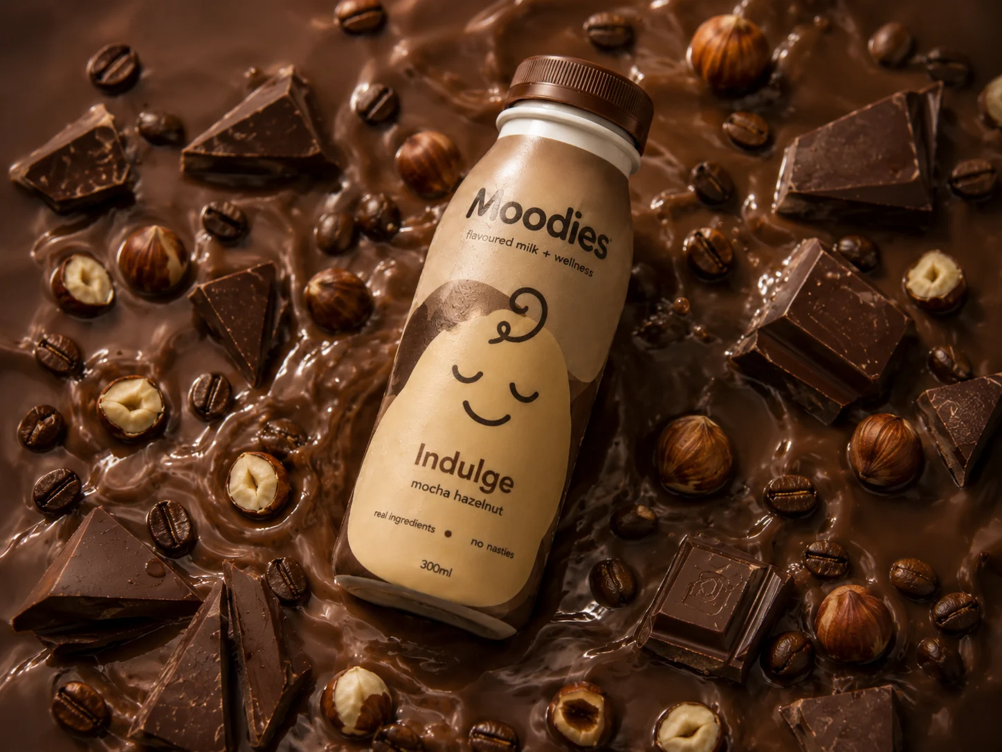
Build one consistent bottle layout with a simplified one-colour wordmark, varying colour, expression and ingredients per mood.
Studio Range
Style the core range - Calm, Focus, Energy and Comfort - each with its matching ingredients, colour palette and lighting.
Immersive Campaign
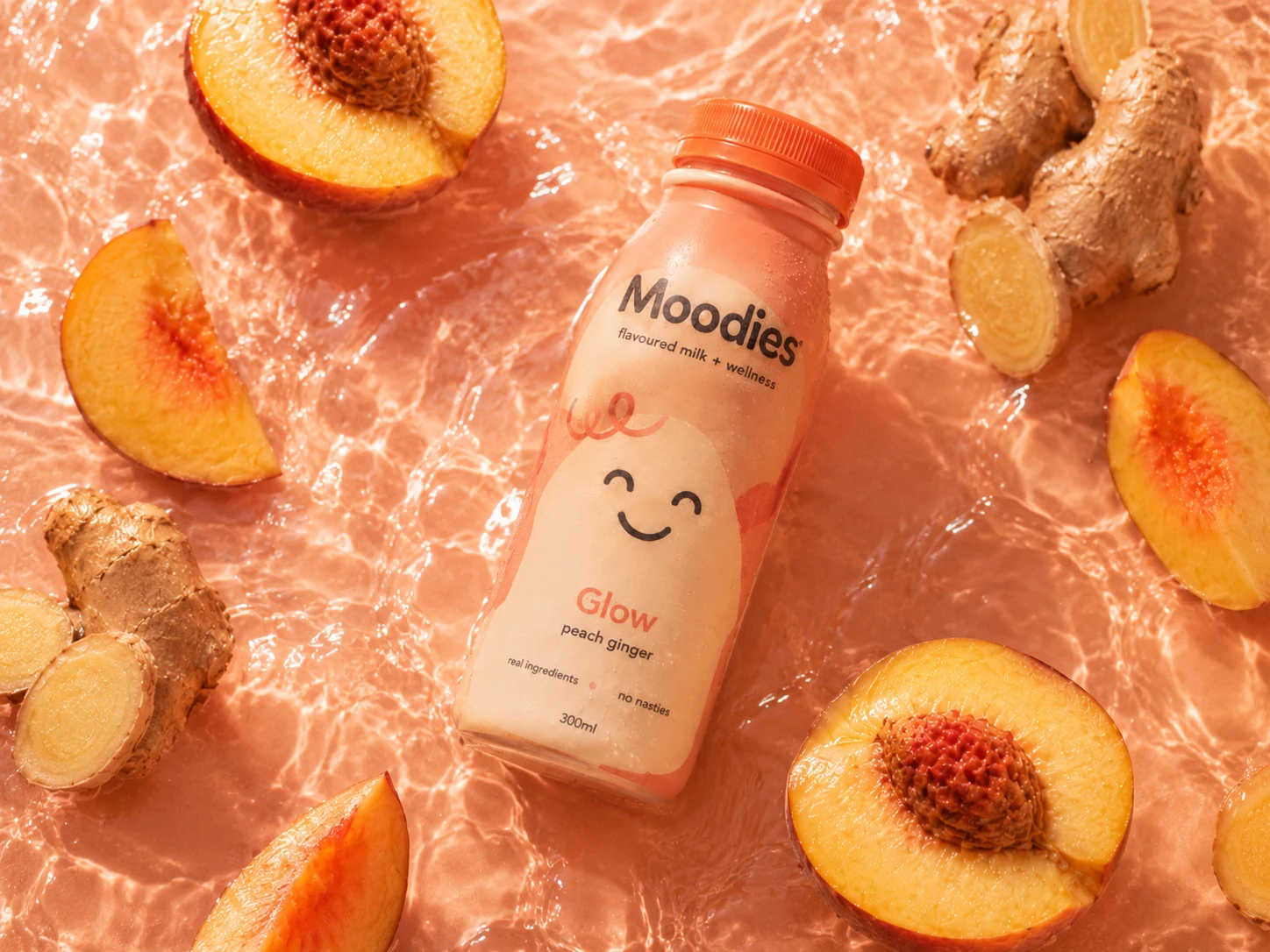
Place bottles diagonally in shallow liquid with their ingredients, edges dissolved so the liquid fills the entire frame.