Extreme Heat
Chillies, sauce texture, warning language and intense flavour cues - the category signals that promise real, punishing heat.
Brand Concept · Extreme Hot Sauce · 2026
Extreme Hot Sauce
Don’t Tame The Beast.
01 — The Concept
Muzzle is a fictional extreme hot sauce brand inspired by aggressive flavour, dinosaur power and bold food advertising. The concept began with a simple idea: create a hot sauce identity that feels like it should come with a warning.
Instead of a friendly chilli mascot or clean craft-food styling, the direction leans into raw energy and intimidation - a muzzled T-rex that turns the sauce into something alive, hungry and ready to break loose across packaging, photography and campaign visuals.
02 — Research Direction
The research focused on three areas - extreme hot sauce packaging, aggressive illustrated mascots and high-impact food advertising - to build a system with a clear personality: hot, loud, fierce and memorable. The T-rex muzzle became the central idea: heat so intense it has to be restrained.
Chillies, sauce texture, warning language and intense flavour cues - the category signals that promise real, punishing heat.
T-rex references, muzzles, teeth and claws - aggressive mascot energy pulled from comic-book art, metal textures and sports logos.
Burgers, fries, sauce drips, smoke and sparks under dark studio lighting - high-impact food advertising that makes heat crave-able.
03 — Colour System
Charred black forms the base, while blood red and hot chilli red bring aggression. Burnt orange and flame amber add sauce warmth, bone cream gives the type a gritty high-contrast finish, and dark metal tones support the muzzle hardware.
04 — Building the Beast
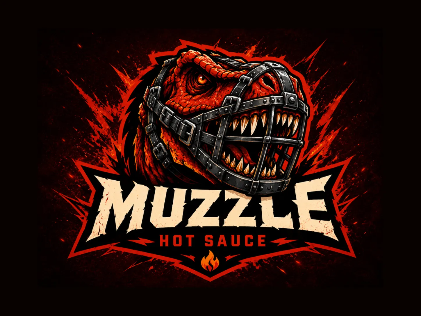
The logo exploration began with one rule: dangerous, not cute. A T-rex immediately communicates power, appetite and aggression - and the muzzle adds the stronger concept: a beast so intense it has to be restrained.
The strongest direction placed the T-rex above the wordmark, with the metal muzzle wrapping the snout as a complete piece of hardware. The final mark unites the dinosaur, muzzle, jagged lettering, flame icon and warning details into one explosive red-and-black symbol.
05 — Typography System
A distressed block display drives the headlines and wordmark, while condensed uppercase support type creates a warning-label feeling across packaging - sharp angles, rough texture and high contrast so Muzzle reads as an extreme flavour brand, not a pantry condiment.
DON'T TAME THE BEAST
UNLEASH THE HEAT
A deep red-orange sauce with visible chilli texture, built to feel rich, spicy and real.
EXTREME HEAT · 5 FL OZ · HANDLE WITH CAUTION
06 — Bottle & Product Photography
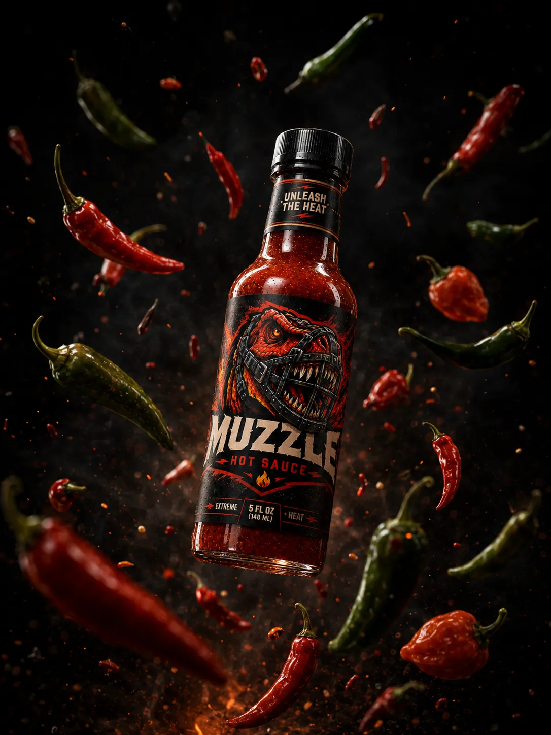
A classic glass hot sauce bottle keeps the product familiar and believable, leaving the label space to carry the aggressive mascot art. A black label, fiery red illustration, distressed cream type and warning-style details make the bottle loud and instantly recognisable, while the neck band reads “Unleash The Heat”.
The photography treats the bottle as the hero - explosive sauce splashes, flying chillies, sparks and dark smoke connect it to the extreme-heat personality, then settle into controlled studio scenes that keep the attitude while feeling real.
07 — Food Pairing Campaign
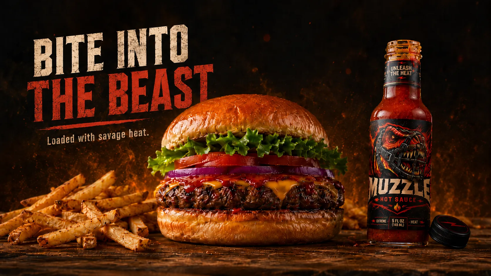
The food campaign moves Muzzle from a bottle concept into appetising, real-world advertising - a burger and fries scene with the sauce oozing through one layer, making the heat feel craveable rather than only aggressive. The food stays the focus; the bottle anchors the brand.
“Loaded with savage heat.”
08 — Campaign World
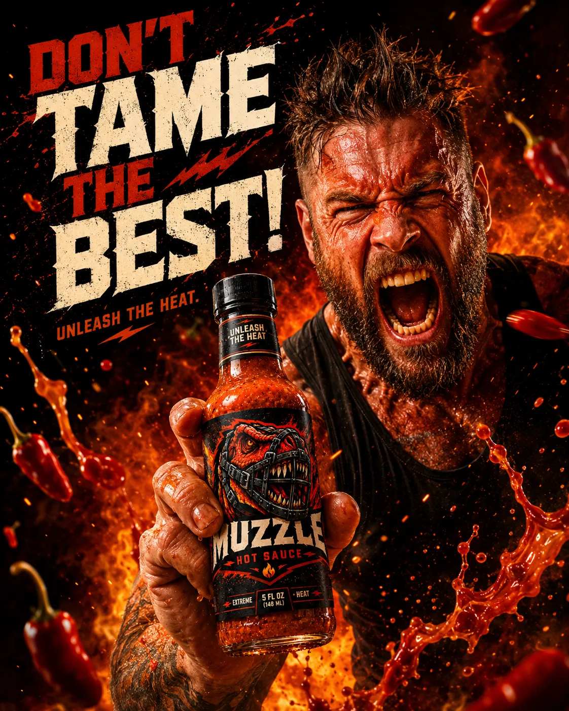
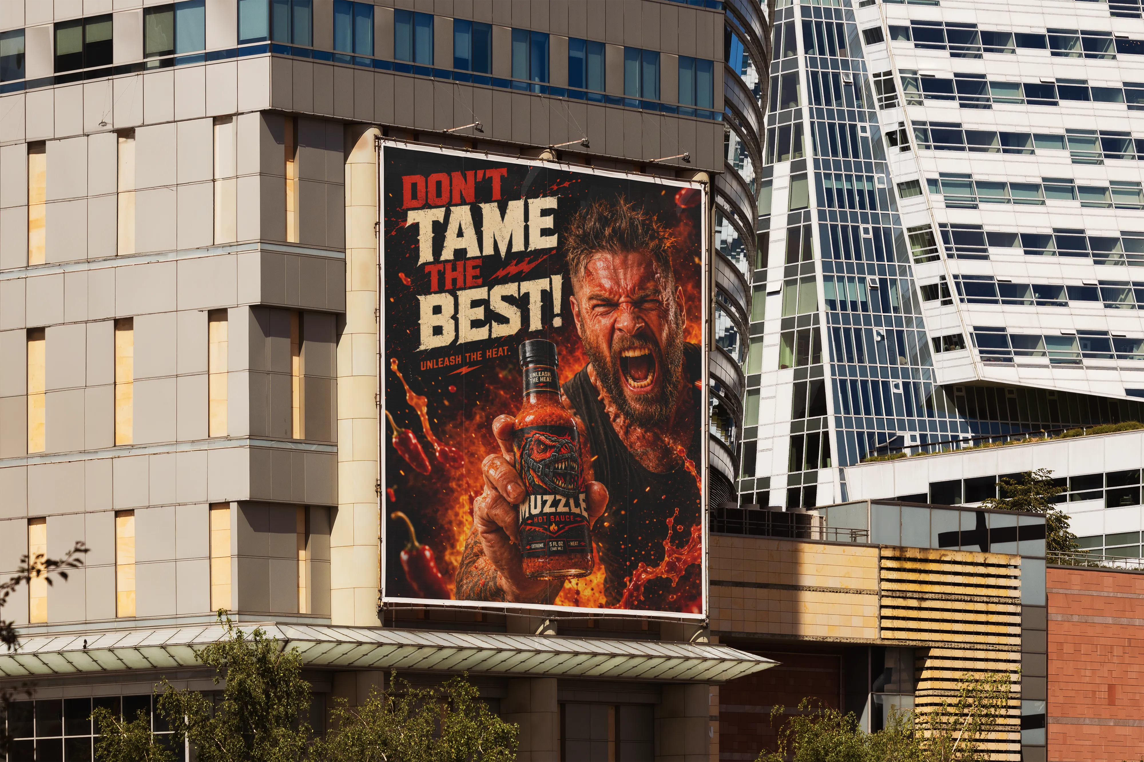
Instead of safe product photography, the campaign pushes the personality into dramatic scenes of fire, smoke, sauce splashes and aggressive headlines. One direction shows a person reacting to the heat in a chaotic way, making the sauce feel physically powerful and almost uncontrollable.
The tone stays short and punchy - lines that feel more like battle cries than product descriptions.
09 — Dominance Ad
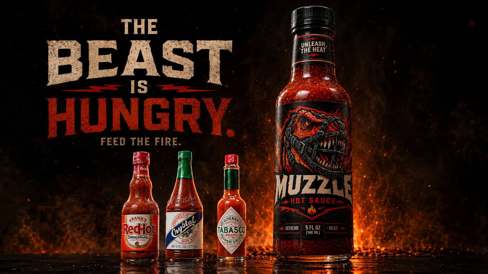
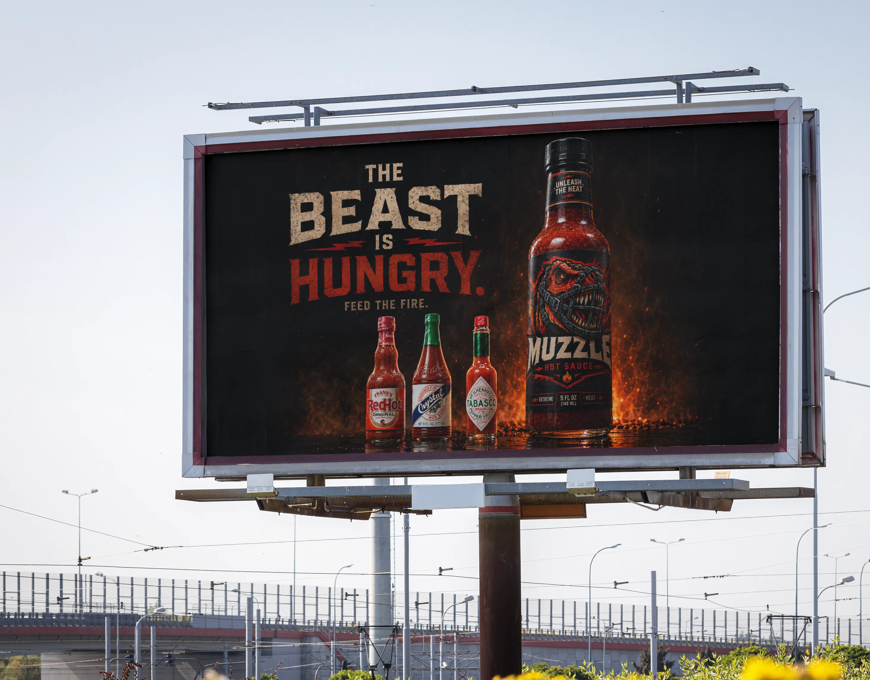
The dominance concept positions Muzzle as the more intense option - three classic-style bottles lined up with Muzzle towering beside them. A dark fiery background, reflections, smoke and ember lighting keep it dramatic but premium, with the label fully visible as the hero.
10 — Brand Values
A hot sauce concept shaped by savage flavour, explosive visuals and a beast that refuses to be tamed.
11 — Final Outcome
The final system moves from research and logo exploration into a fully realised bottle, product photography, food pairing campaign and bold advertising world. A muzzled T-rex mascot, jagged distressed type, black-and-red packaging, visible chilli texture, cinematic lighting and short aggressive hooks all work together to make Muzzle feel intimidating, appetising and highly recognisable - not just a mockup, but a full visual world built on heat, hunger and dominance.