Zombie Chaos
Horror-comic graphics, toxic symbols, splatter textures and mutant character energy - the apocalyptic attitude at the core of the brand.
Brand Concept · Zombie Soda & Energy Drink · 2026
Zombie Soda & Energy Drink Concept
Fuel Your Flavour Frenzy.
01 — The Concept
Razz is a fictional soda / energy drink brand inspired by zombie graphics, mutant fruit characters, apocalyptic energy and loud flavour-led packaging. It began with a simple idea: a berry drink that feels cheeky, punchy and slightly sarcastic - then pushed into a full visual world that could expand across multiple intense flavours.
Rather than a clean health-drink direction, Razz leans into chaos as its core brand language. Every flavour feels like its own mini outbreak, while the logo, can structure and campaign style keep the range consistent.
02 — Research Direction
The research focused on three areas - zombie & apocalypse graphics, high-impact beverage packaging and exaggerated fruit illustration - to build a brand with real attitude, a recognisable character system and a campaign style that reads loud from the first glance.
Horror-comic graphics, toxic symbols, splatter textures and mutant character energy - the apocalyptic attitude at the core of the brand.
Fruit explosions, intense colour, liquid splashes and flavour-specific ingredient styling that makes every can feel like its own outbreak.
Energy-drink packaging, bold logos, 440ml proportions, condensation and realistic studio lighting that keep the range retail-believable.
03 — Colour System
Hot pink, berry purple and acid green form the core identity, with black and deep purple for apocalyptic depth and off-white to make the logo pop. Each flavour then shifts the palette while keeping the same chaotic attitude.
04 — Building the Zombie Wordmark
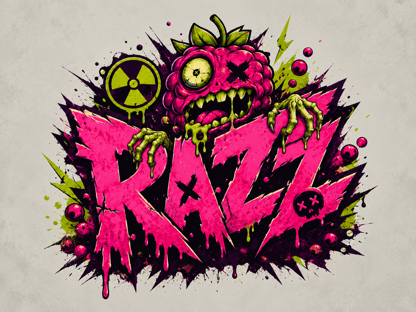
The logo turns the Razz name into a loud, sharp, slightly sarcastic mark. Early directions explored chunky lettering, graffiti type, comic outlines, drips and splatters. The strongest combined a jagged wordmark with a zombie-berry character that sits with the type rather than floating above it.
The letters were balanced for readability on a can, the busy Z detail simplified, and the berry zombie given thin arms that grab the A and Z - tying the mascot into the typography. A flavour-free master version anchors the system before adapting to each can.
05 — Typography System
A distorted display direction drives the brand headings and flavour names, supported by cleaner condensed type for packaging details - heavy outlines, exaggerated shadows and uneven spacing for a chaotic energy that still works across labels and ads.
FUEL YOUR FLAVOUR FRENZY
Nitro Watermelon
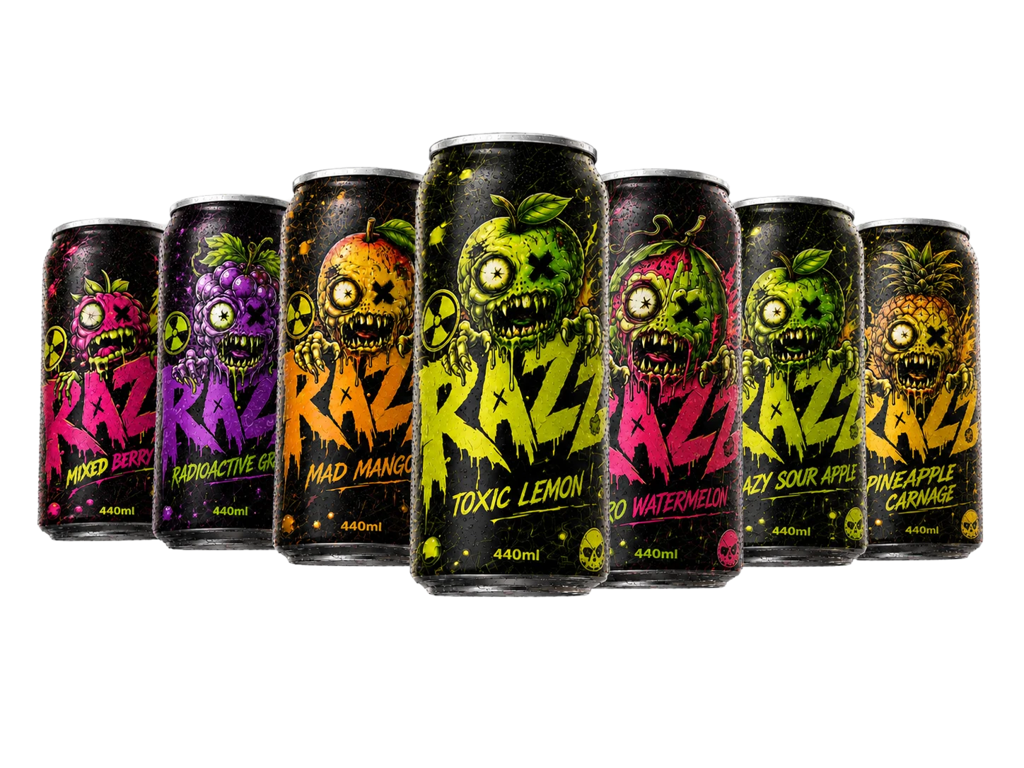
Every flavour feels like its own mini outbreak, while the logo and can structure keep the range consistent.
440ML · BOLD FLAVOUR · MAXIMUM CHAOS
06 — 440ml Can & Label
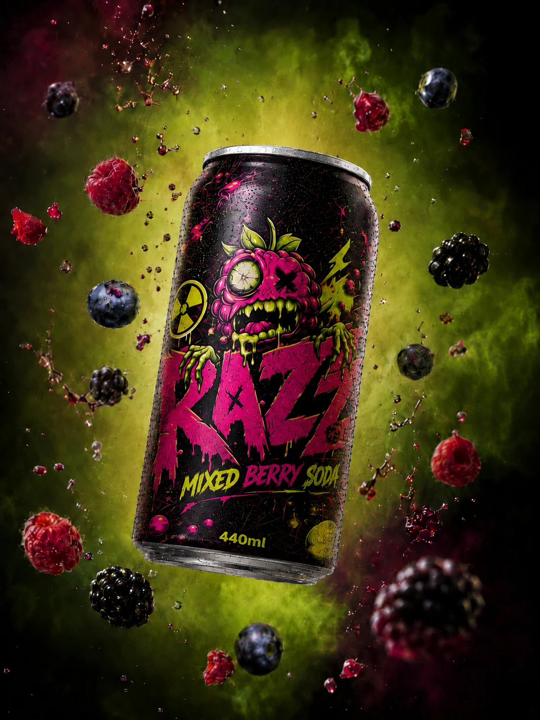
A standard 440ml aluminium can keeps the product believable, with a wider body, correct pull-on-tab and realistic studio lighting. The full-wrap label places the Razz logo in the centre, and each flavour reuses the same core layout while the palette, mascot and ingredients change.
Condensation, aluminium highlights, sharp rim details and accurate tabs were the refinements that pushed the mockups out of flat concept art and into believable studio photography.
07 — Interactive 3D
The Toxic Lemon can, fully modelled in 3D - open the viewer to spin the full wrap, zoom into the label detail, and read the back-of-pack story straight off the aluminium.
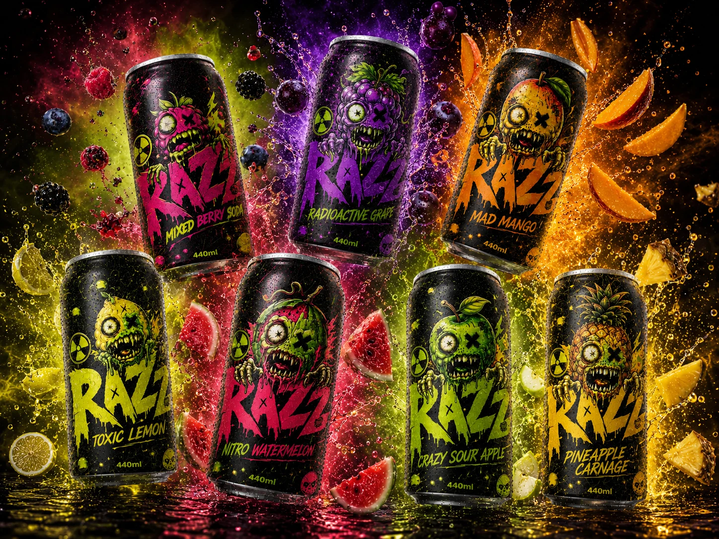
08 — Mutant Flavour Range
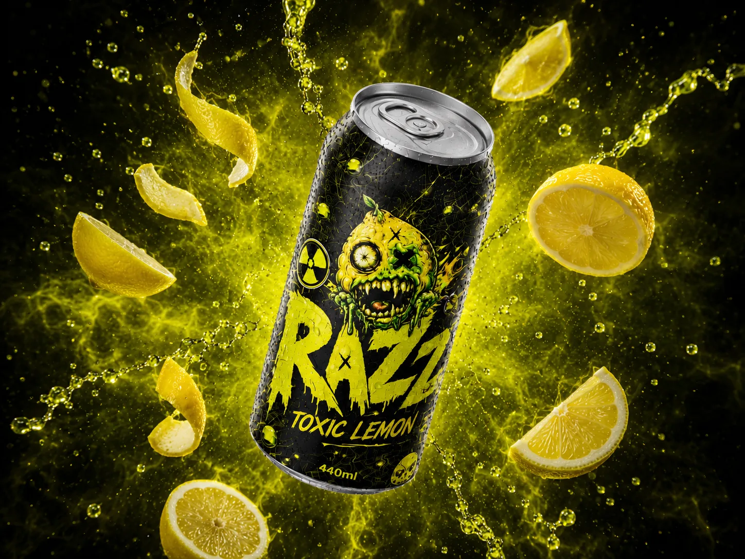
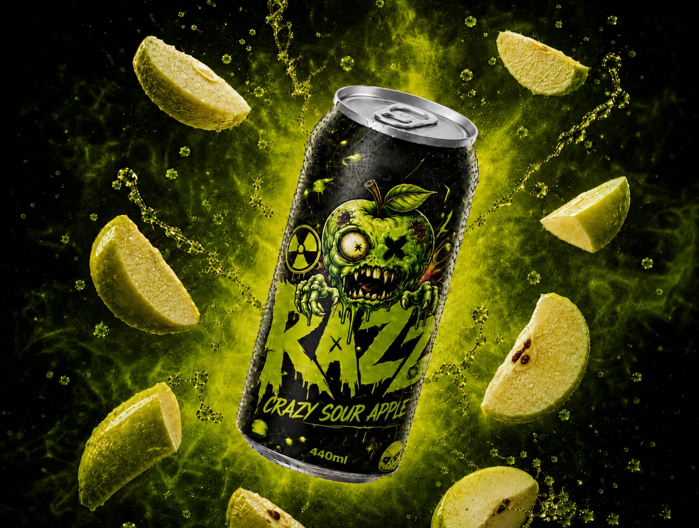
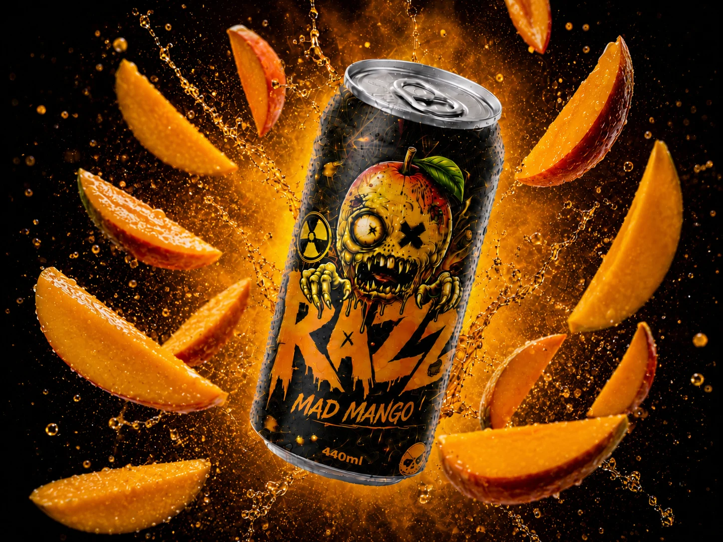
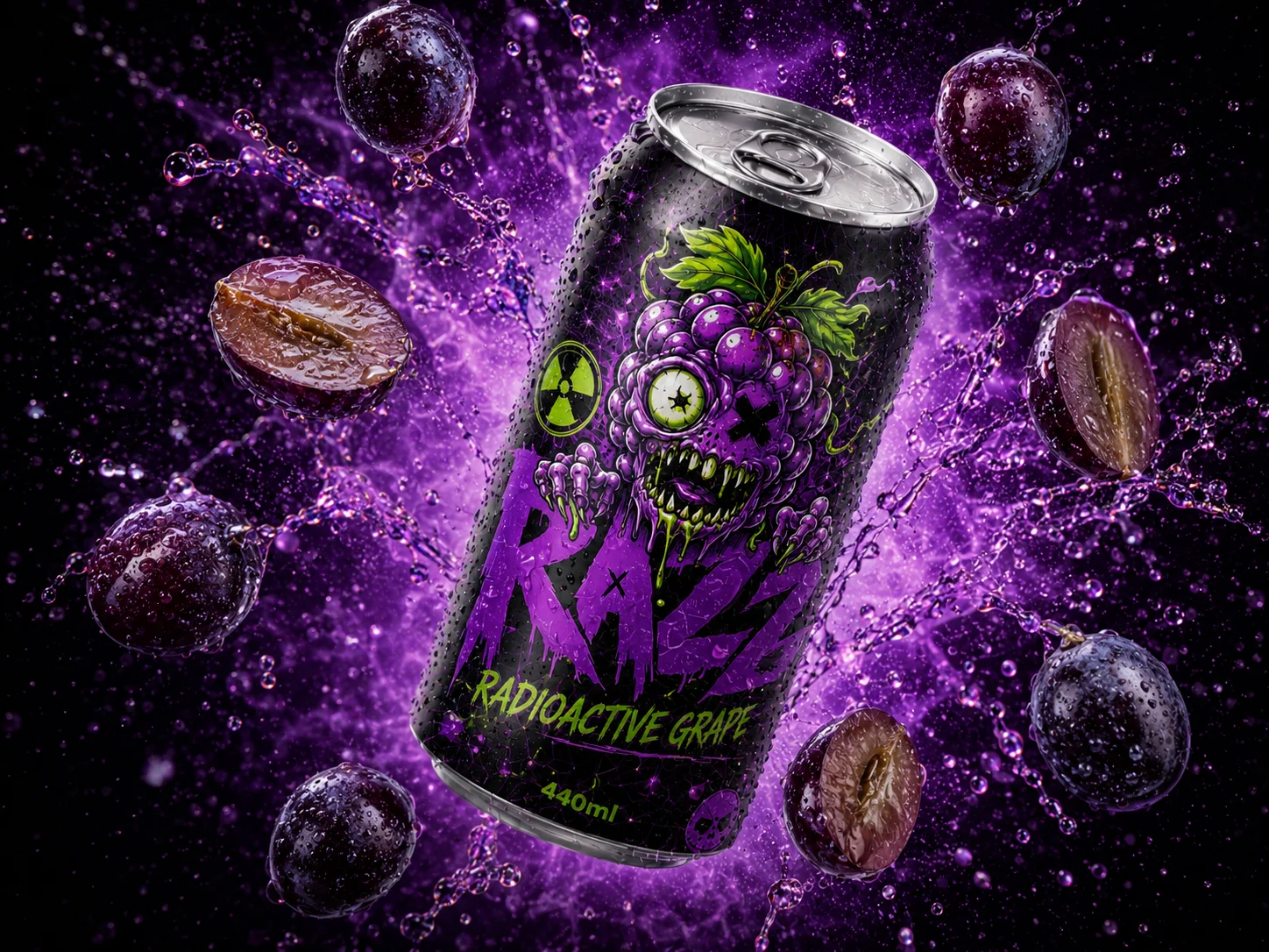
Each drink gets a name that feels intense and slightly ridiculous - its own colour world, zombie-fruit mascot and explosive product shot, while the can structure and logo hold the range together.
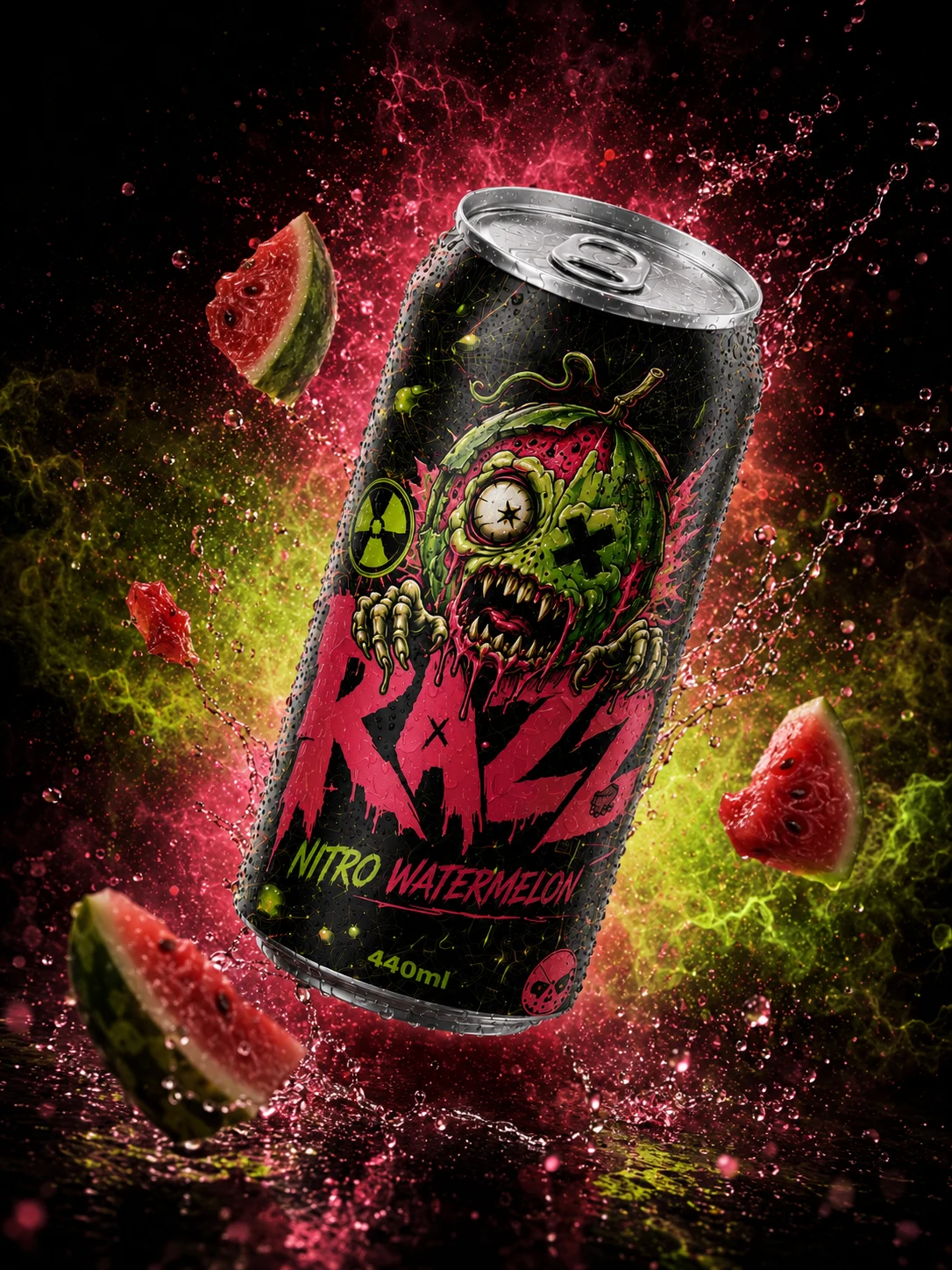
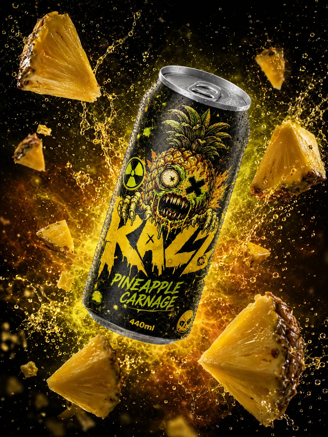
09 — Explosive Studio Shots
Floating cans, dramatic backlighting, fruit pieces, liquid splashes, smoke and neon glow create a sense of motion. The can is always the hero, the ingredients support the drink, and the lighting matches each flavour palette.
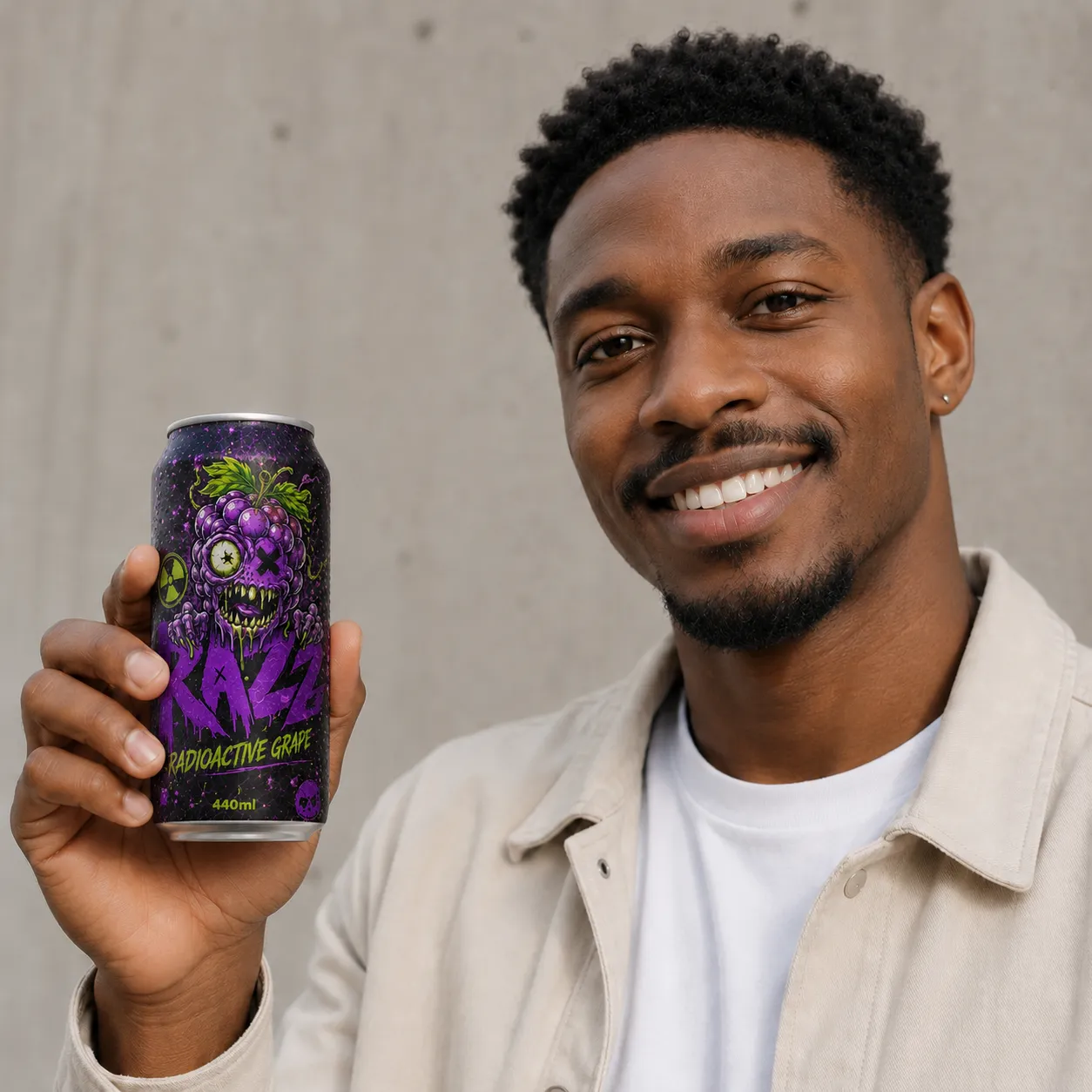
10 — Campaign World
Beyond the studio, the campaign drops the cans into loud, cheeky lifestyle scenes - bold characters, colourful walls and that same chaotic, flavour-driven attitude. The tone stays consistent: chaotic, cheeky and high-impact.
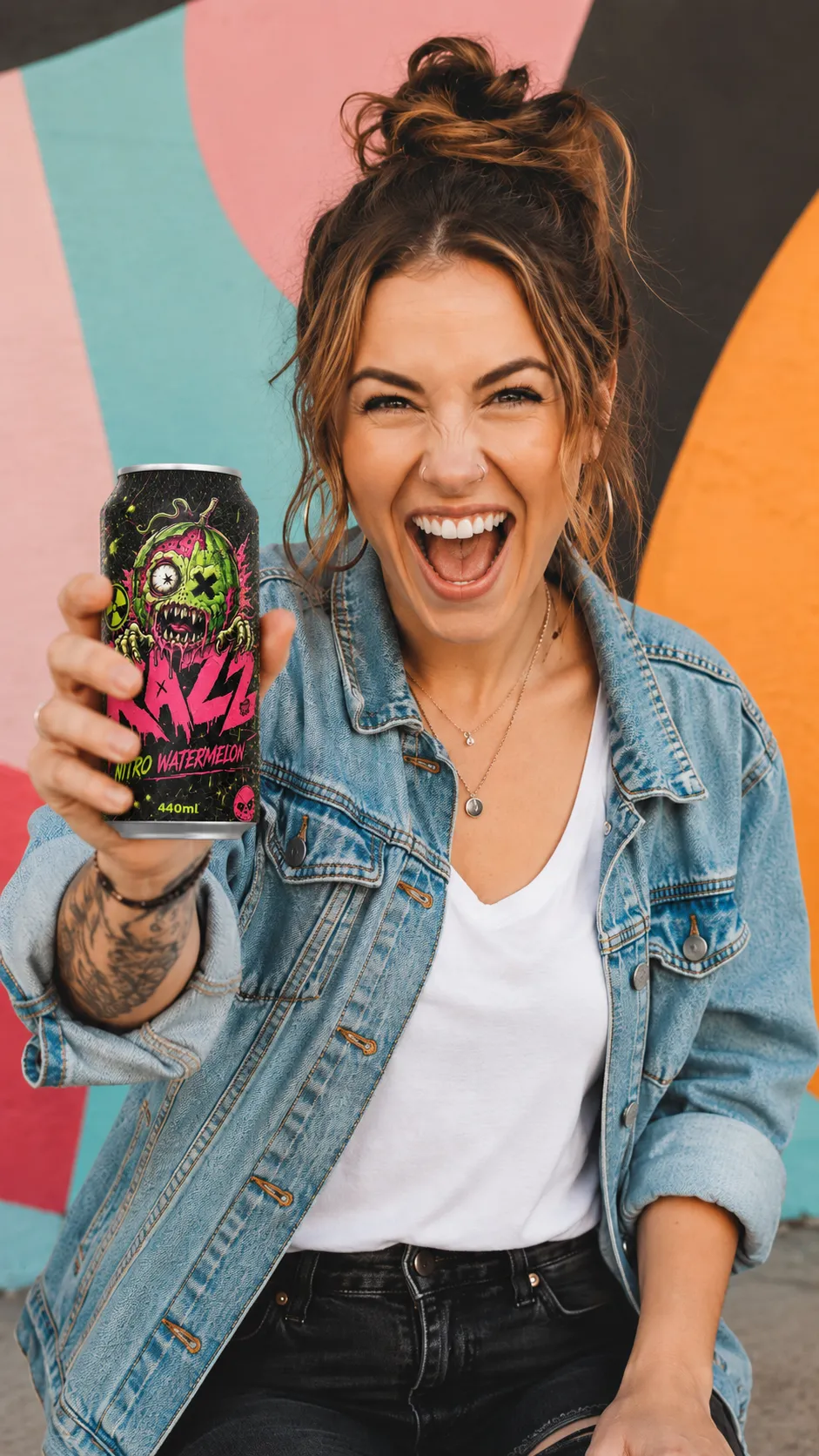
“Fuel Your Flavour Frenzy.”
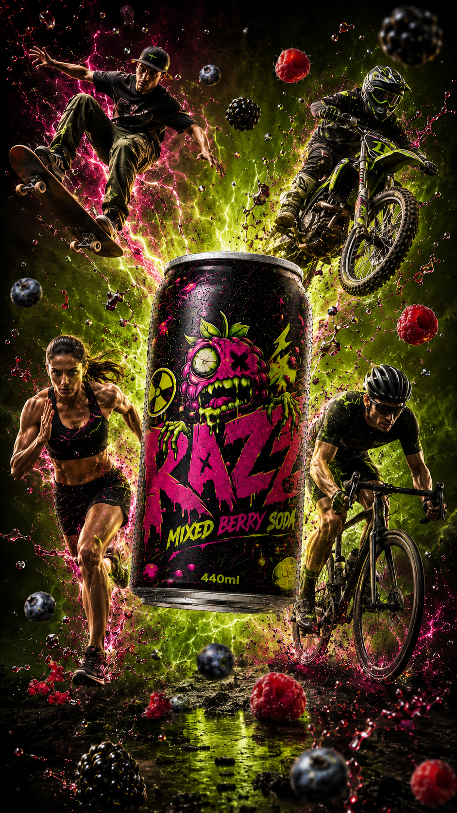
11 — Explosive Poster Concept
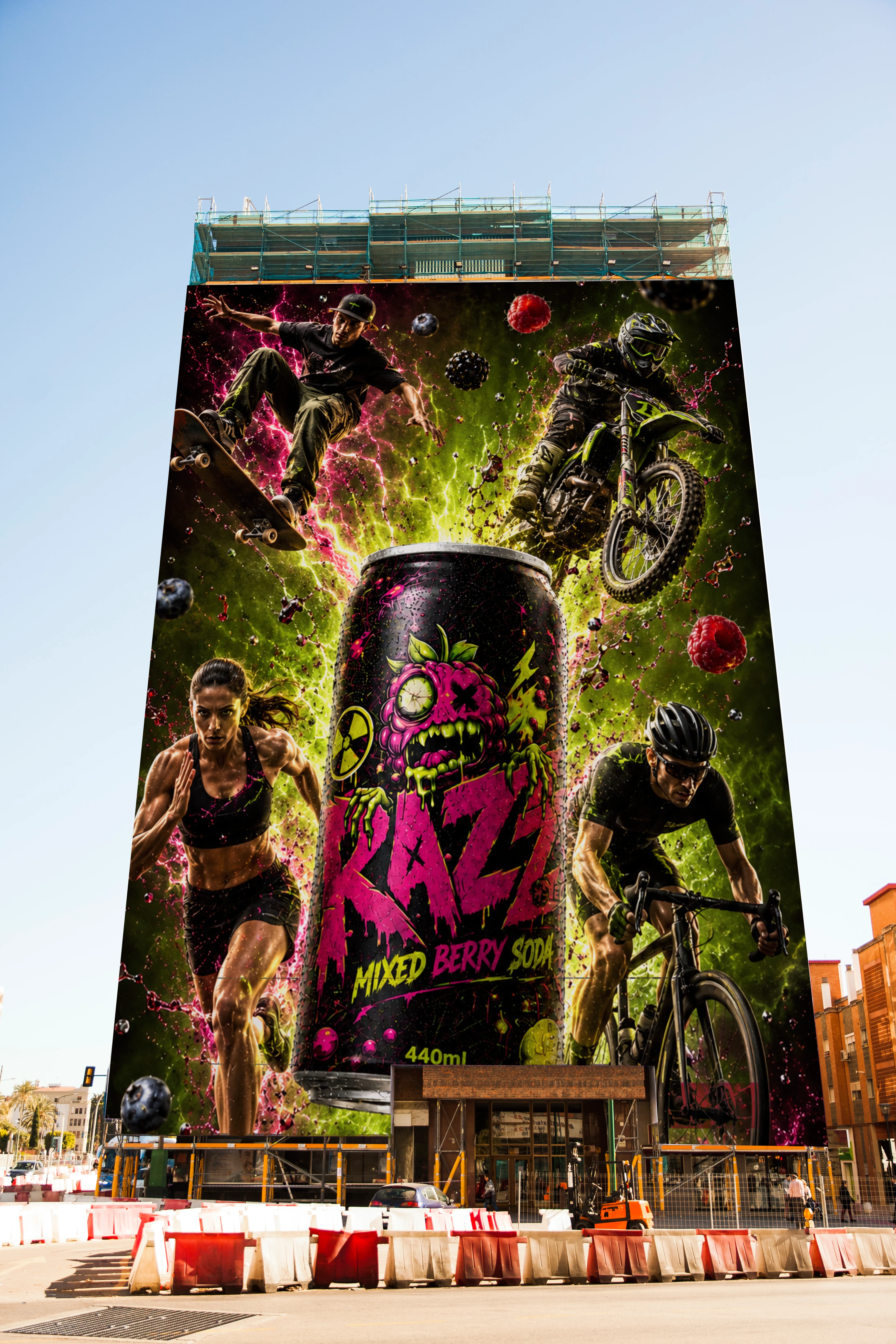
The poster keeps the can as the hero, surrounded by fruit pieces, liquid bursts, smoky neon gradients and rough apocalyptic textures - an image that works as a launch poster, social visual or building-takeover billboard.
12 — Brand Values
A zombie-inspired drink concept shaped by mutant fruit, explosive colour and unapologetic visual energy.
13 — Final Outcome
The final system moves from logo and mascot development into a complete 440ml can range, flavour system, product-photography style and campaign world. A jagged zombie wordmark, mutant fruit mascots, full-wrap cans, flavour-coded palettes, accurate can details and dramatic fruit-explosion visuals make Razz feel loud, chaotic, playful and instantly recognisable - not just a mockup, but a full flavour universe built on chaos, character and energy.